Monarque Events
Project
Naming
Branding
Website
We helped this high-end event planning company build a strong and distinctive brand. Our mandate included naming research, positioning, visual identity development, and website design and development. Our goal was to create an image that matched the exceptional experience Alexandra Painchaud promises her clients, while reflecting her expertise, attention to detail, and ability to create unforgettable moments.
See website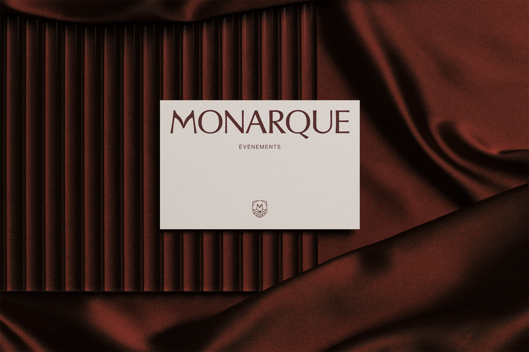
The name - Monarque
We drew inspiration for the name Monarque from the symbolism of the monarch butterfly. This species perfectly embodies the sense of intentional transformation, remarkable presence, and precise trajectory we wanted to convey through the brand.
This symbolism reflects the company’s role as an orchestrator: planning every detail to deliver a seamless and memorable experience. The monarch butterfly also evokes leadership and vision, positioning the company as a trusted partner that guides its clients every step of the way.
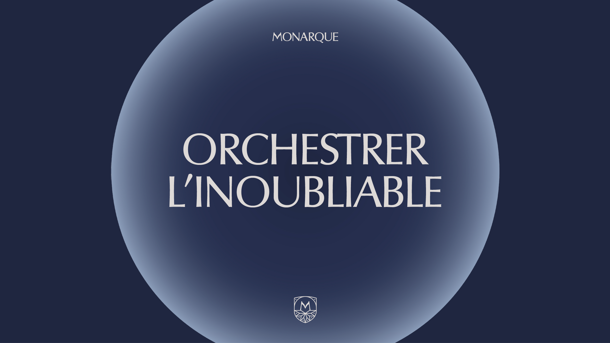
The tagline - Orchestrer l'inoubliable
With this tagline, we wanted to express Monarque Events’ core promise. The verb “orchestrer” (to orchestrate) conveys mastery, coordination, and meticulous execution, while “l’inoubliable” (the unforgettable) captures the emotion and sense of wonder at the heart of the experiences they create.
Together, these two words embody the company’s positioning: a team capable of transforming countless details into a seamless, memorable, and flawlessly executed experience.
Artistic Direction
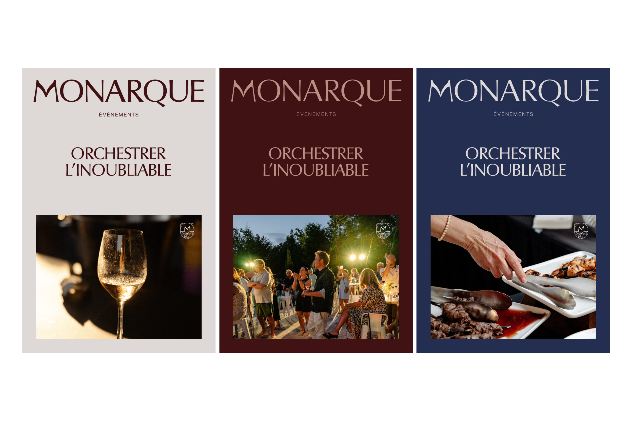
We built the brand identity around four key communication pillars: reliability, brilliance, excellence, and commitment.
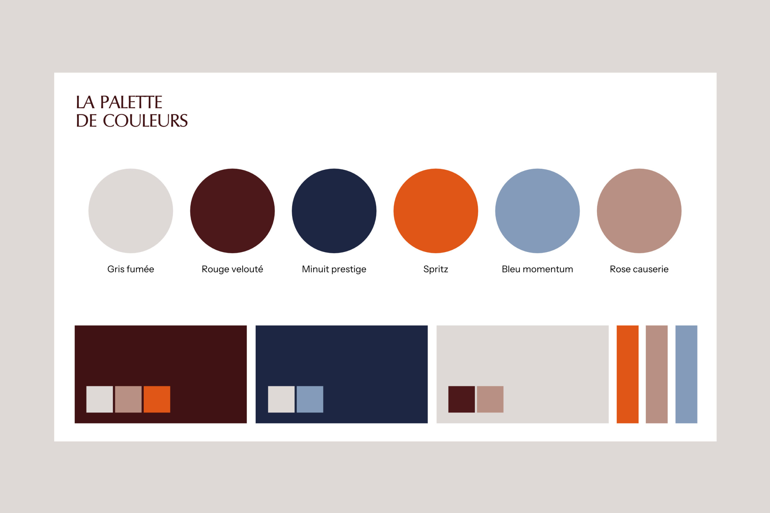
Visually, we opted for a refined aesthetic that conveys luxury through restraint. We played with the contrast between dark and light to create an element of surprise and showcase each element with elegance, while adding subtle touches of colour to bring vitality and character to the identity.
Because people are at the heart of the company’s work, photography plays a central role in the visual identity. We focused on emotions and interactions that tell the story behind each event.
The Logo
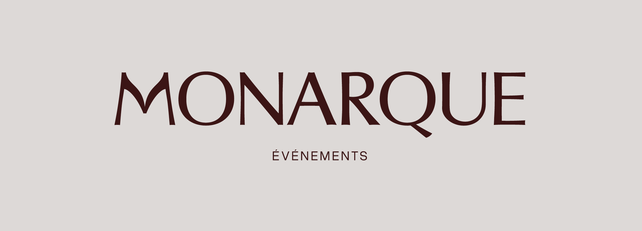
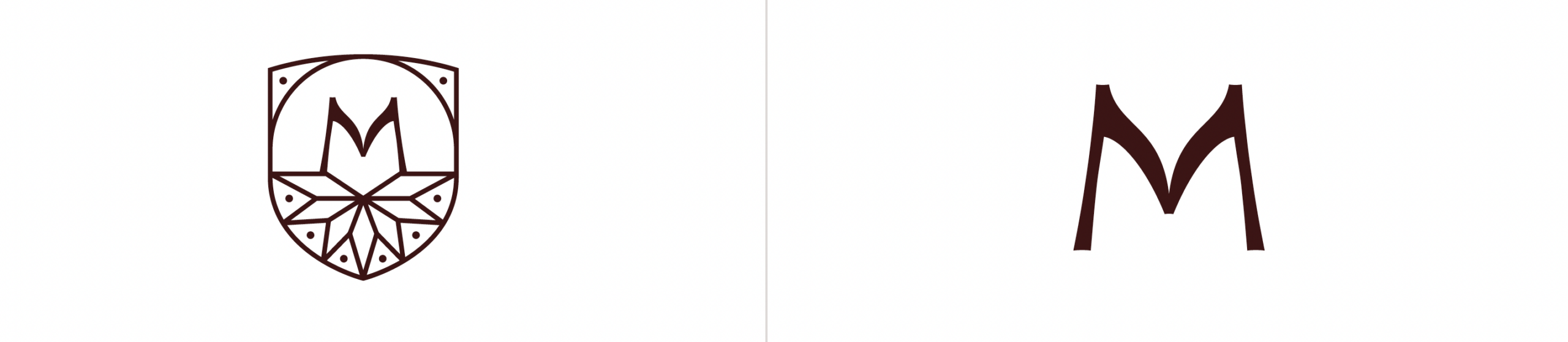
We designed the logo with subtle inspiration from the monarch butterfly, without ever resorting to a literal representation. The letter M echoes the delicate, graceful shape of its wings.
The crest is adorned with a mosaic pattern inspired by the monarch’s distinctive markings. This allowed us to create a symbol rich in meaning while maintaining a refined, understated aesthetic that conveys a sense of quality.
The all-caps typography, inspired by classical Roman inscriptions, brings the sense of reassurance, stability, and prestige we were looking for, balancing the softness of the organic forms.
The System
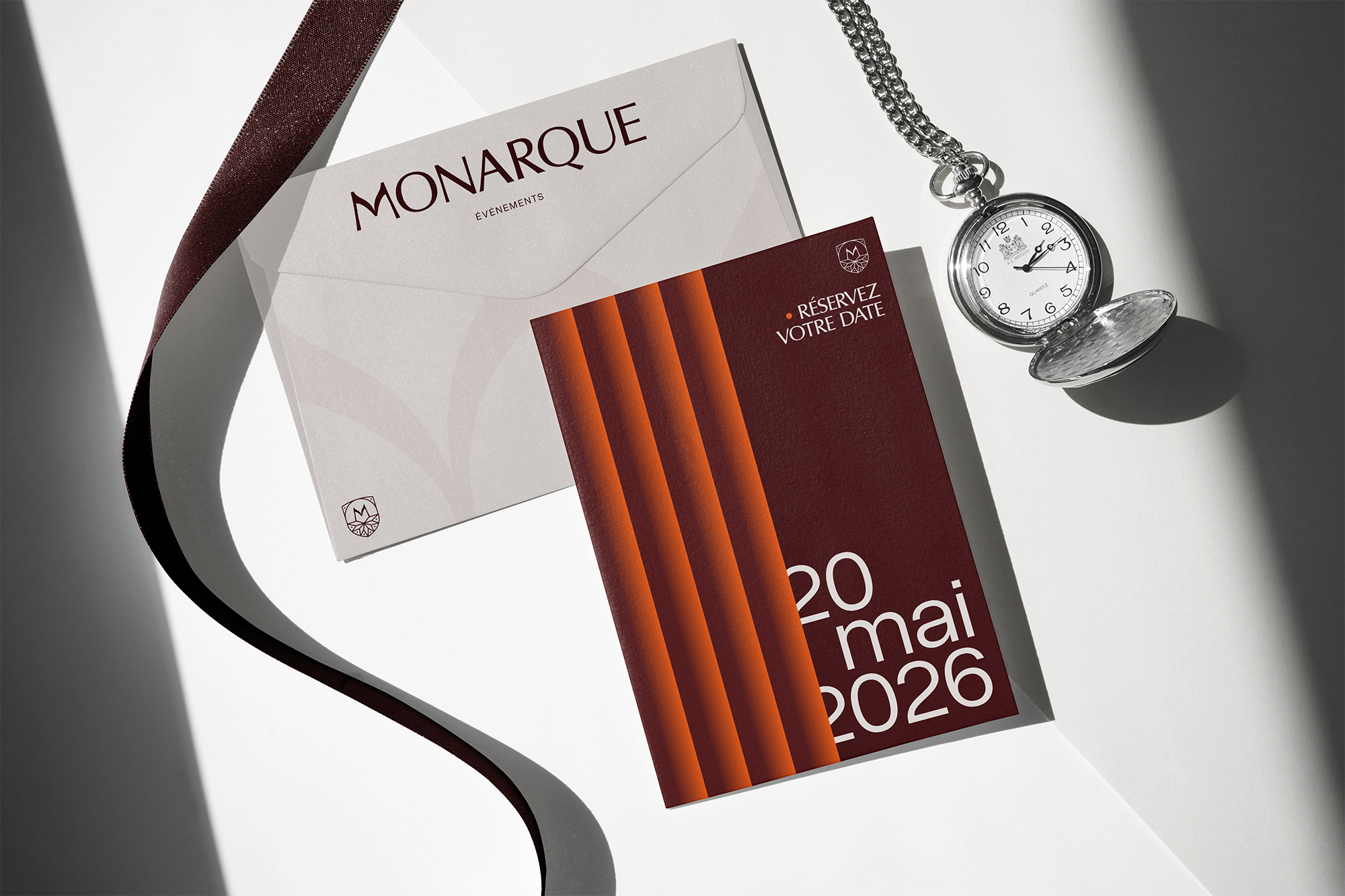
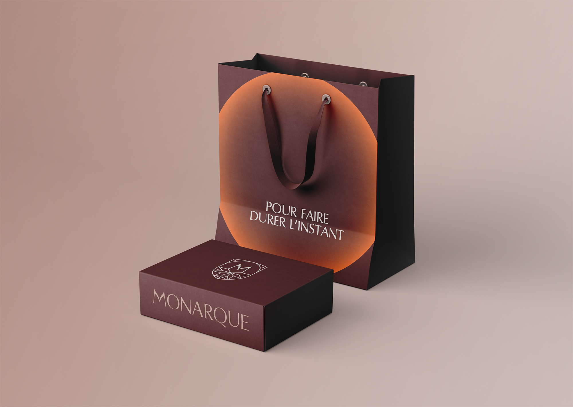
We developed the entire graphic system to translate the experience offered by Monarque Events: impeccable organization in service of the magic of the moment.
Gradient-coloured spotlights sculpt the light and create an immersive atmosphere within calls to action. The visual identity is punctuated by a touch of surprise through vibrant orange, which serves as a distinctive signature. Graphic lines, reminiscent of curtains opening, reveal information like a carefully staged event. Every detail was thoughtfully designed to convey precision and elegance, creating the perfect balance between prestige and approachability.
The Website
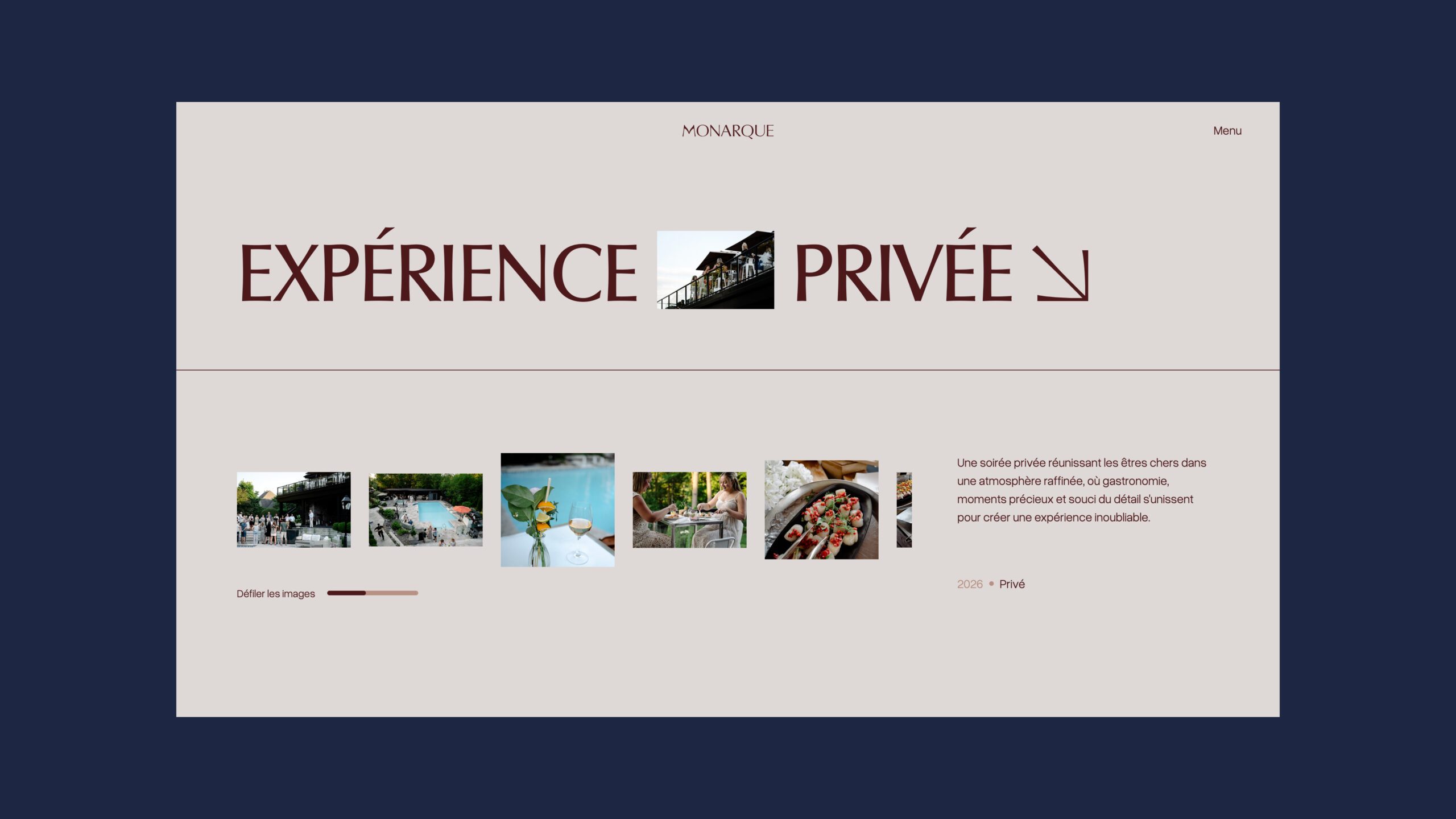
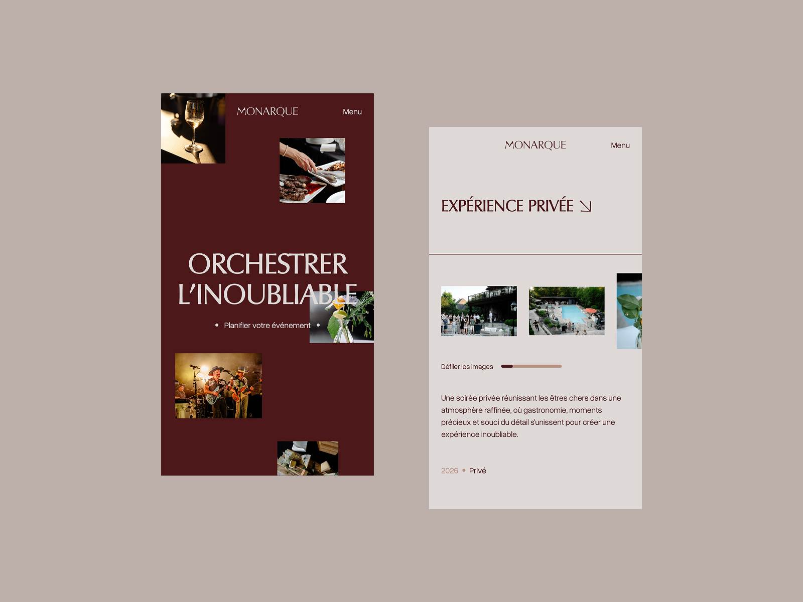
We envisioned the website as an immersive showcase, designed to immediately reflect the level of excellence of Monarque Events.
The intentionally streamlined navigation puts their work and expertise front and center. Subtle animations were incorporated to guide users through the experience with elegance, while maintaining an overall sense of effortless control.
The flow of the website is enhanced by the contrast between light and dark sections, allowing photography to take center stage and bring the emotion of each event to life. The result is an elegant, intuitive experience that is fully aligned with the brand’s high-end positioning.
The Photography Style
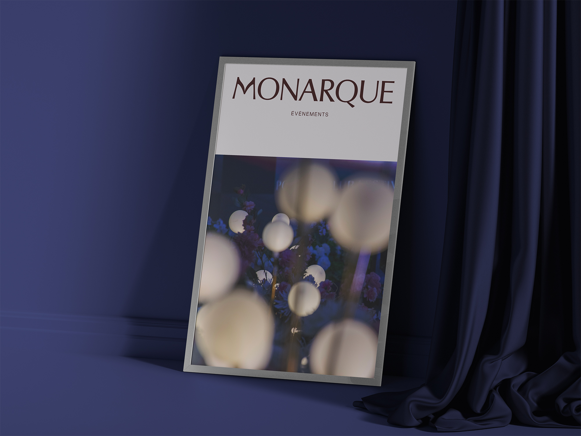
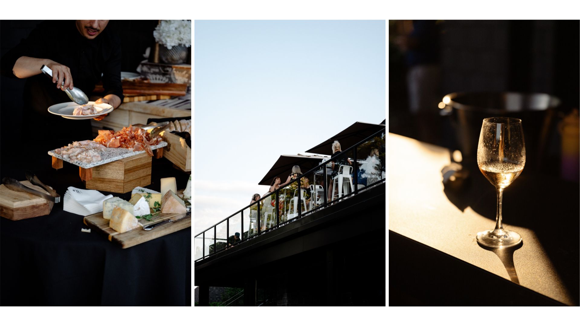
We developed a photography style built around a striking interplay of light and shadow. Through directional lighting and intentional contrast, we sculpt each scene to highlight the details, creating an atmosphere that feels both dramatic and refined.
People are portrayed in a fragmented way. Hands, gestures, interactions are drawing attention to the intention and connections behind each moment. Light becomes a storytelling element in its own right, symbolizing the brilliance of the moments orchestrated by Monarque Events.
The Client's Experience
I am extremely happy with the work Solstice’s team did on my company’s brand identity and website. They took the time to truly understand my needs and created a unique visual identity that perfectly reflects my vision. Their service was professional and efficient, and the final result exceeded my expectations. I highly recommend their services.
Alexandra Painchaud, Founder
Credits
Photographer: Tania Lemieux and Christelle Coulombe
Website's Artistic Direction: Bryan Machado, Alexandre Giroux and Johanny Gastonguay
Our other projects

For the love of collaboration