Team Québec
Project
Merchandise
Branding
Team Québec is Quebec’s national ringette team in Canada. Its visual identity, originally created in the 1980s, needed a refresh to better reflect the evolution of the team, its players, and its growing presence.
The mandate was to modernize the brand while preserving a strong Quebec essence, without relying on expected symbols or clichés. We also wanted to create a unifying identity that could strengthen the players’ sense of belonging and proudly represent a new generation of athletes.
The Logo
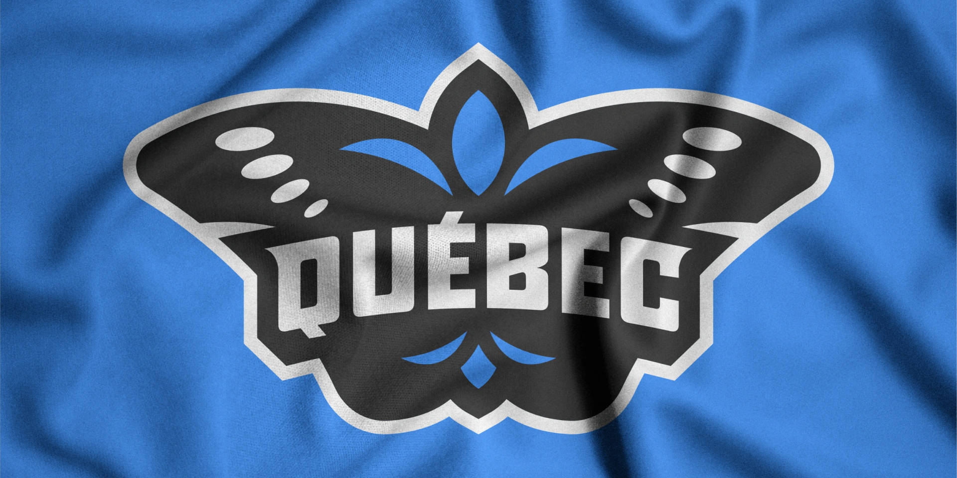
We chose to use a lesser-known symbol of Quebec: the White Admiral, the province’s official insect. This decision reflects a desire to highlight a symbol that feels unique, bold, and distinctive.
The butterfly evokes finesse and passion. It also symbolizes renewal, the arrival of a new generation of players, and the beginning of a new era for Team Québec. It became a meaningful way to represent a roster that evolves year after year, while creating a welcoming identity for new players proud to represent their province.
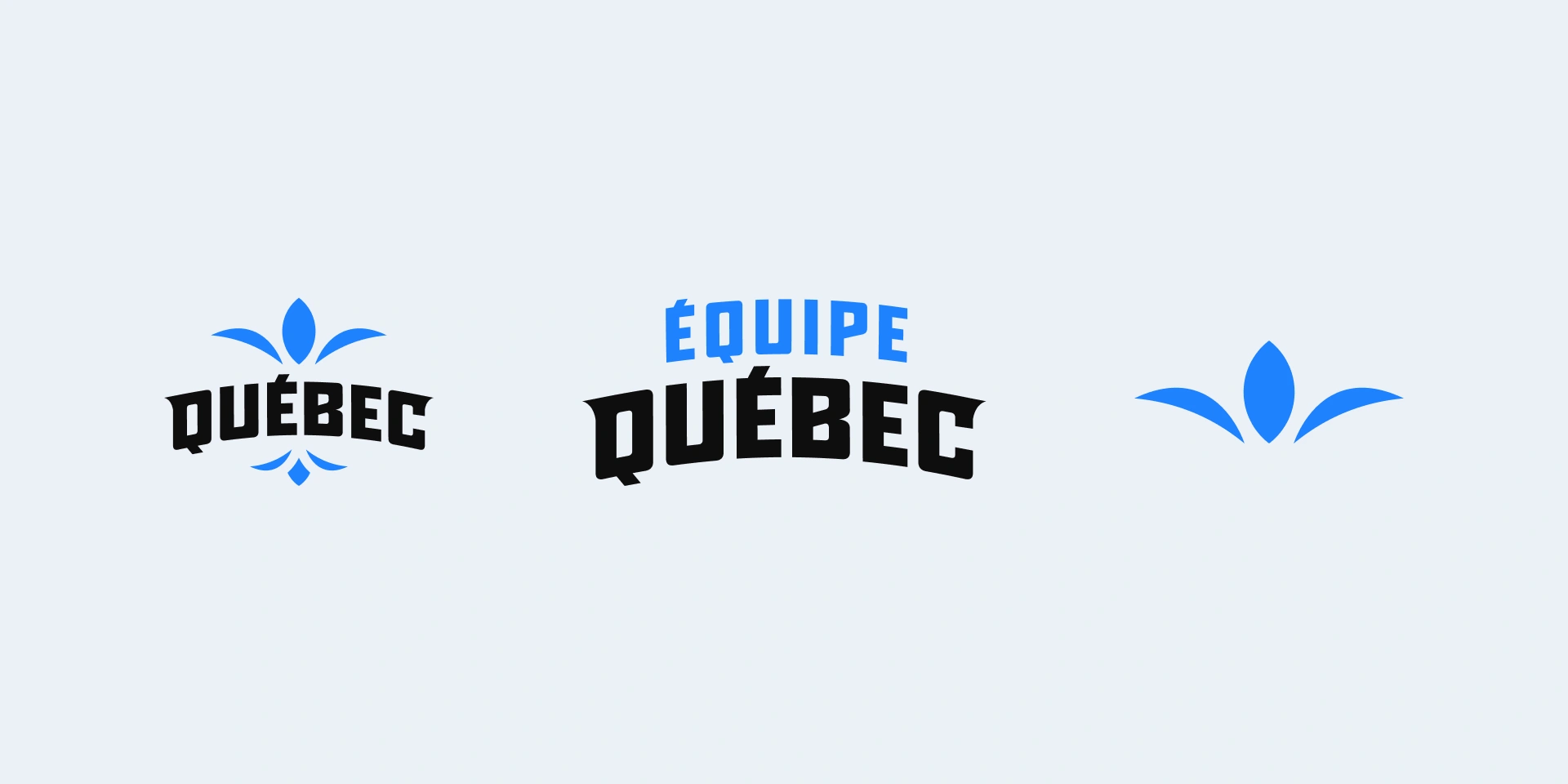
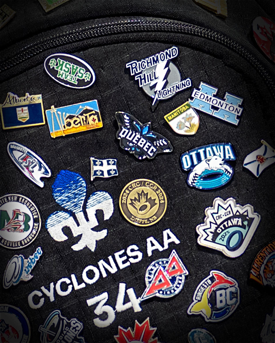
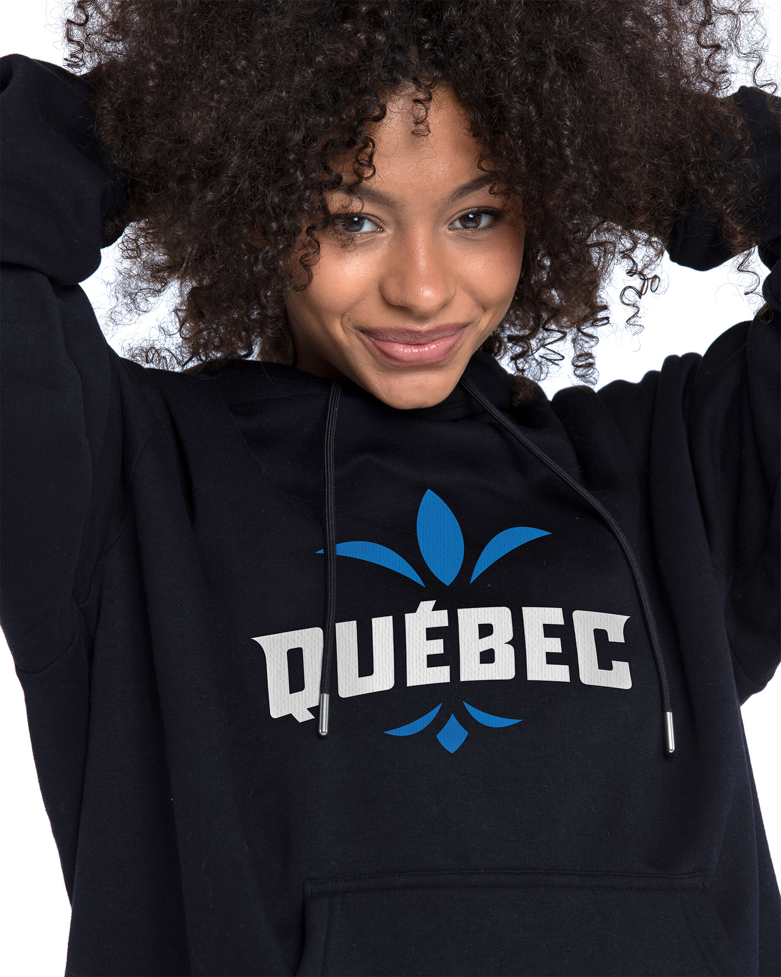
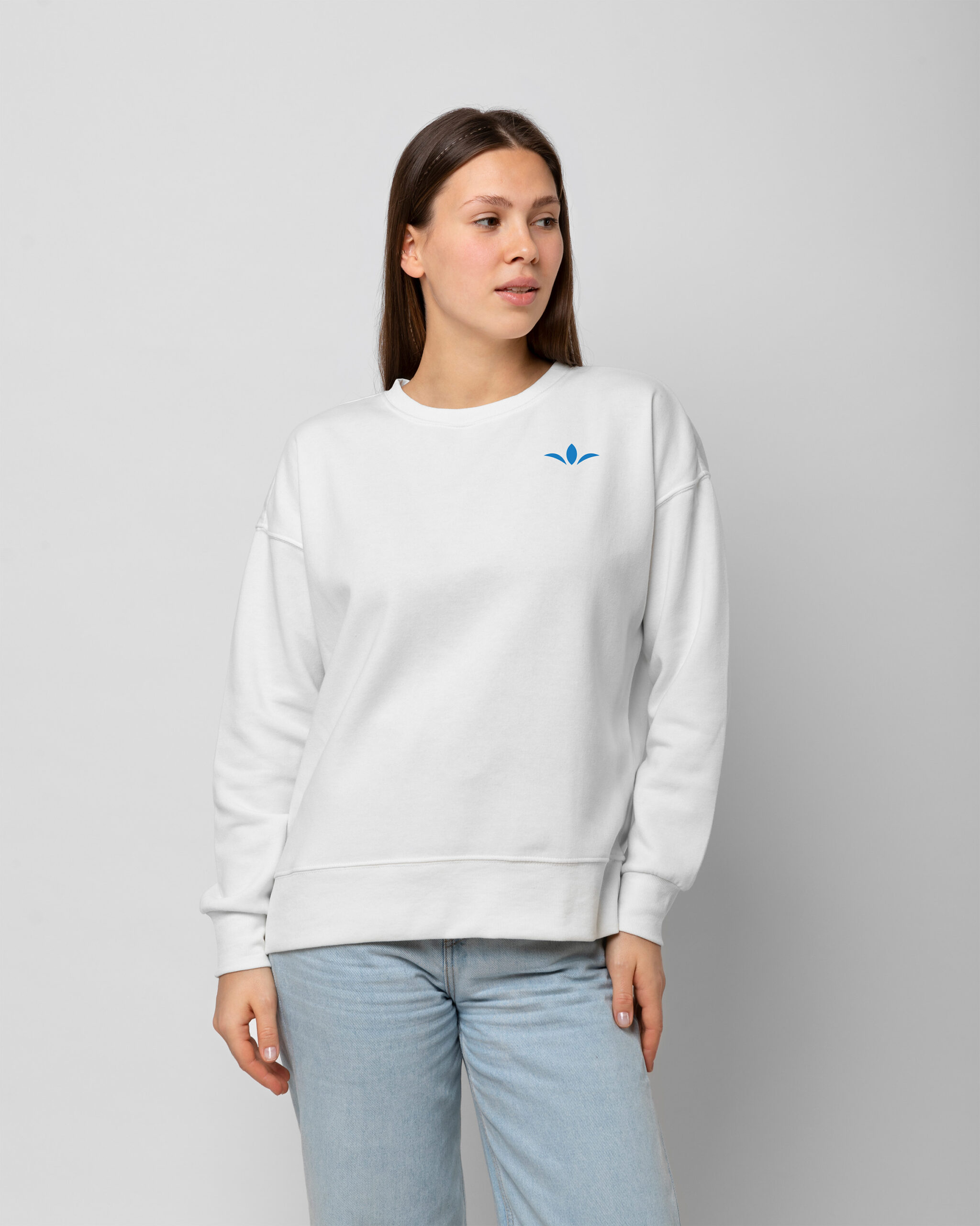
The fleur-de-lis, a strong symbol of Quebec’s identity, was integrated in a more subtle and stylized way to move away from more traditional representations. This approach grounds the identity in Quebec culture while maintaining a modern, elegant, and athletic aesthetic.


The Merchandise
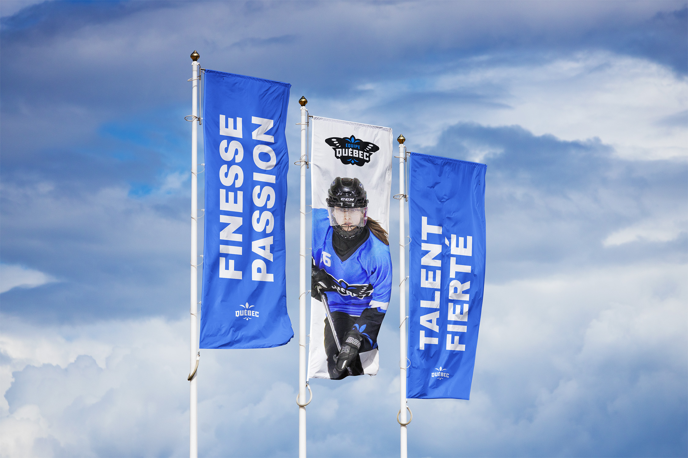
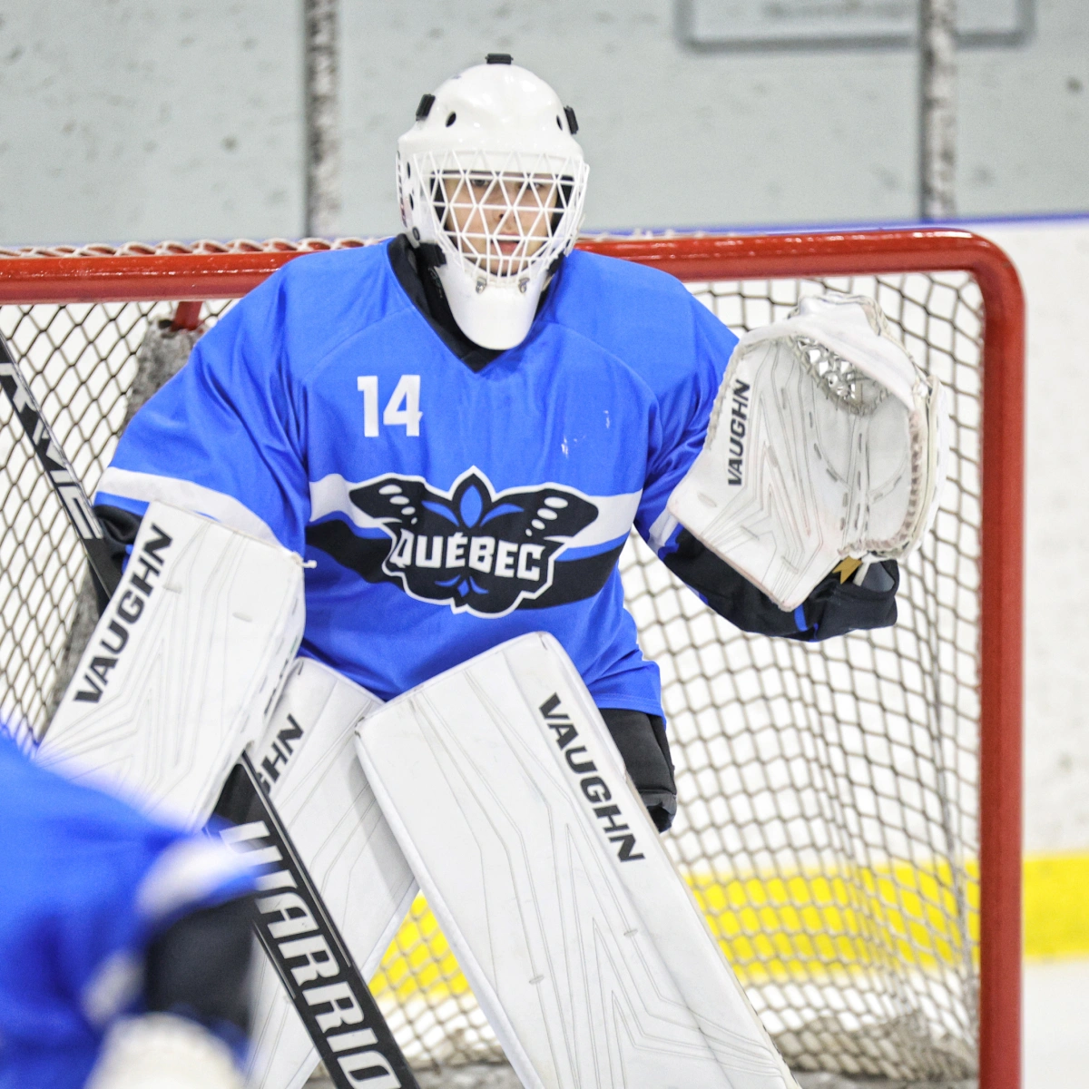
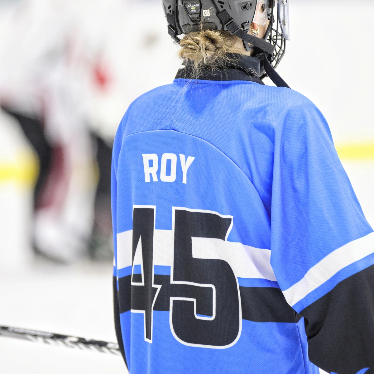
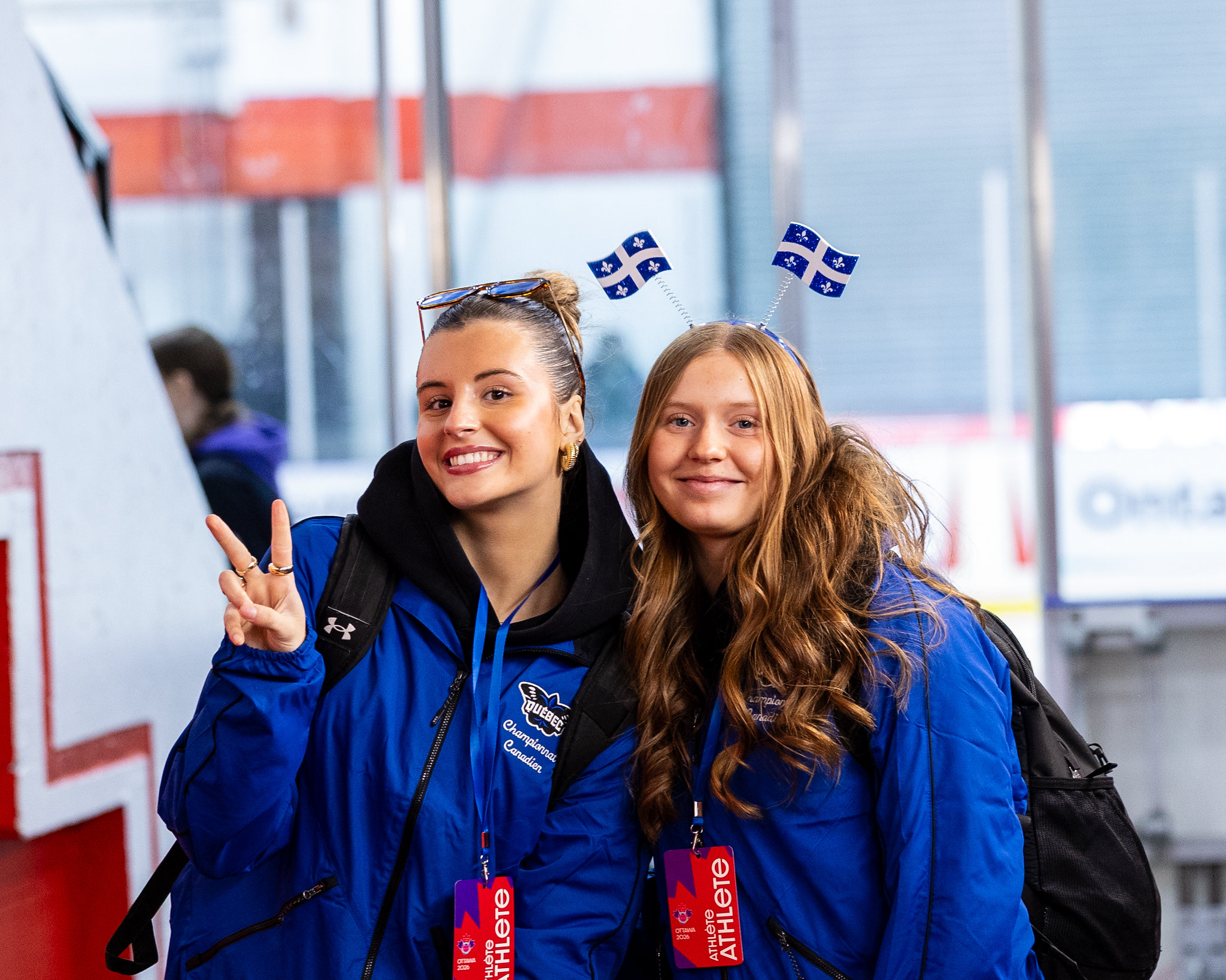
The players’ uniforms were designed using the visual codes of major professional sports leagues. The objective was to create a strong, credible, and confident presence that reflects the talent and level of commitment of the athletes.
The jerseys adopt a more mature and contemporary aesthetic, allowing Team Québec to stand out visually while strengthening its sense of unity. Graphic details, contrasts, and the treatment of the logo all contribute to a proud and recognizable identity, both on the ice and beyond the game.


Credits
Photos: André Vandal and Omar Nalley
Our other projects

For the love of collaboration