Synovalys
Project
Branding
Website
Synovalys is a company born from a passion for business management and supporting small and medium-sized enterprises. Founded by Sabrina, it is driven by a clear mission: to simplify entrepreneurs’ lives by bringing multiple services together under one roof.
The objective of this project was to translate that approach into a brand identity that reflects both the company’s strategic expertise and the human side of its support. We developed a brand identity and website aligned with this promise: providing a structured, reassuring, and accessible framework tailored to the unique reality of each business.
The Direction
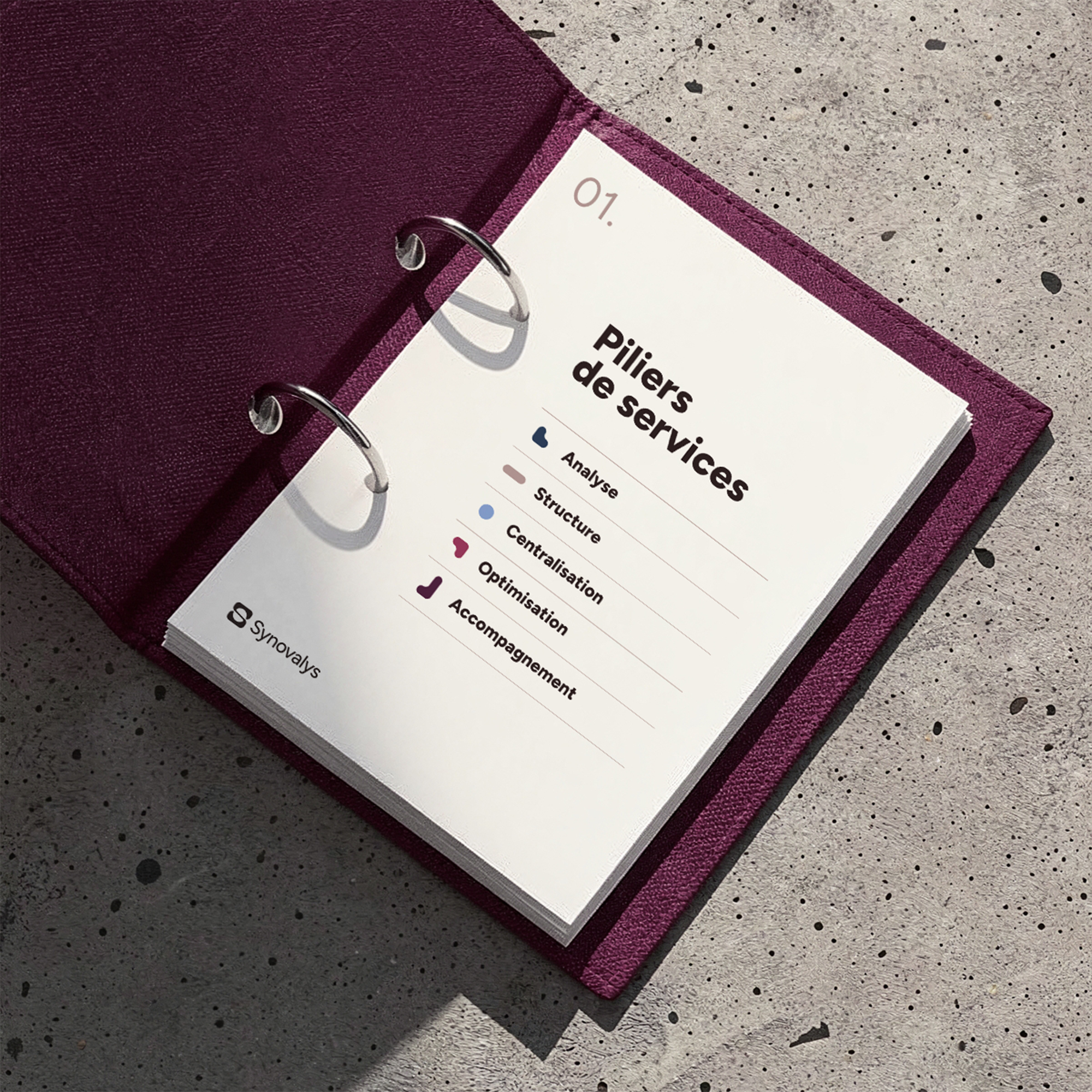
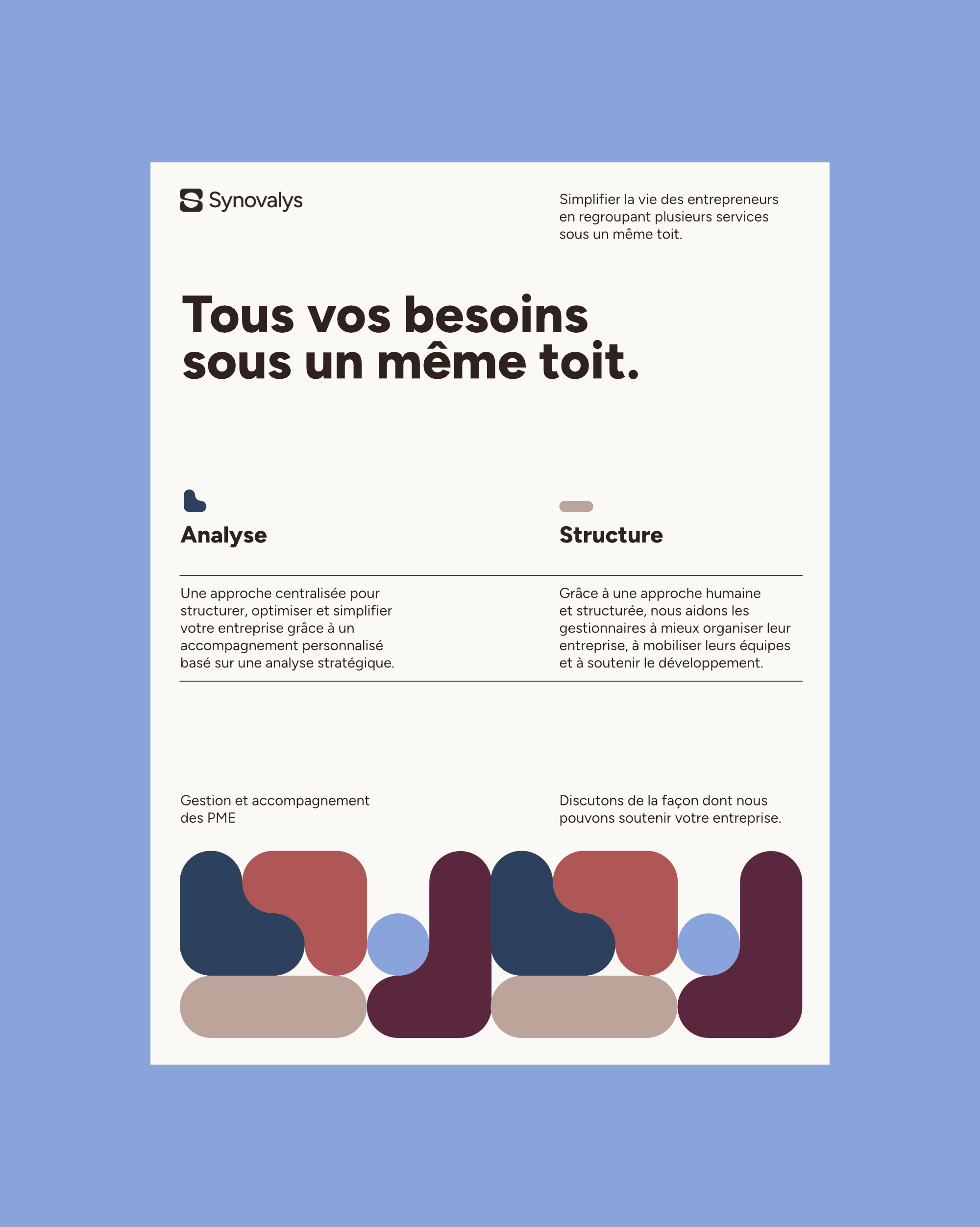
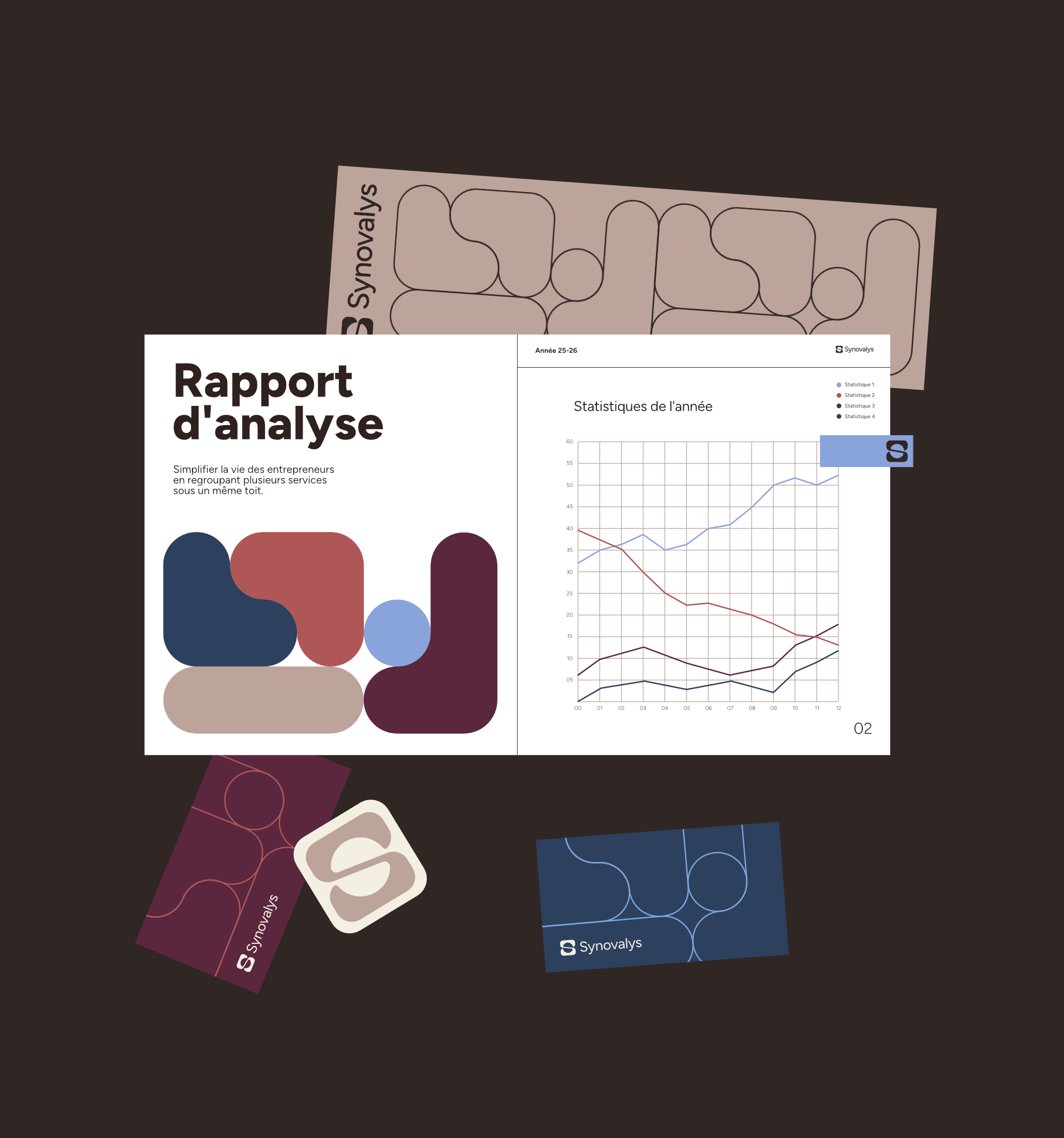
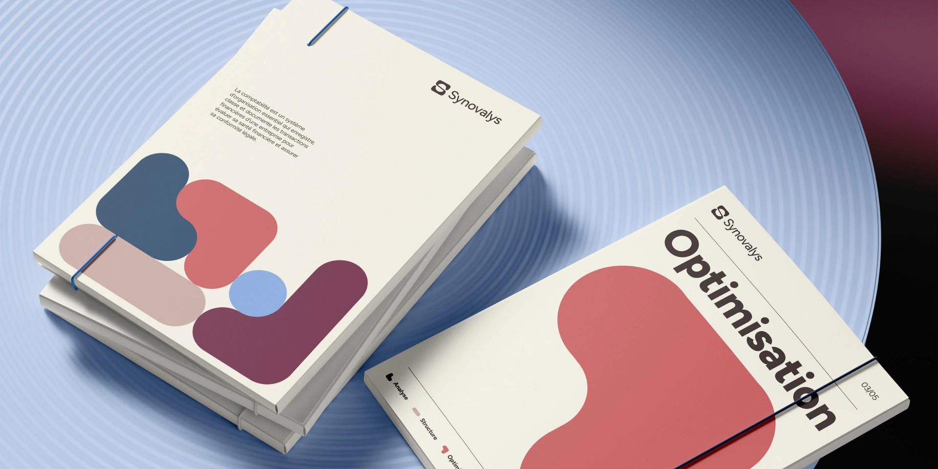
The brand identity is built around four communication pillars: clarity, warmth, vitality, and centralization.
Every visual element was designed to support this intention. The shapes and colours convey a sense of structure and organization while maintaining a flexibility that reflects the human side of the company’s approach. The entire visual language is rooted in a central concept: bringing together, simplifying, and aligning.
This direction comes to life through a composition of interlocking and overlapping shapes that represent the company’s different areas of expertise. Together, they form a unified structure, a visual expression of Synovalys’ promise: all your business needs, under one roof.
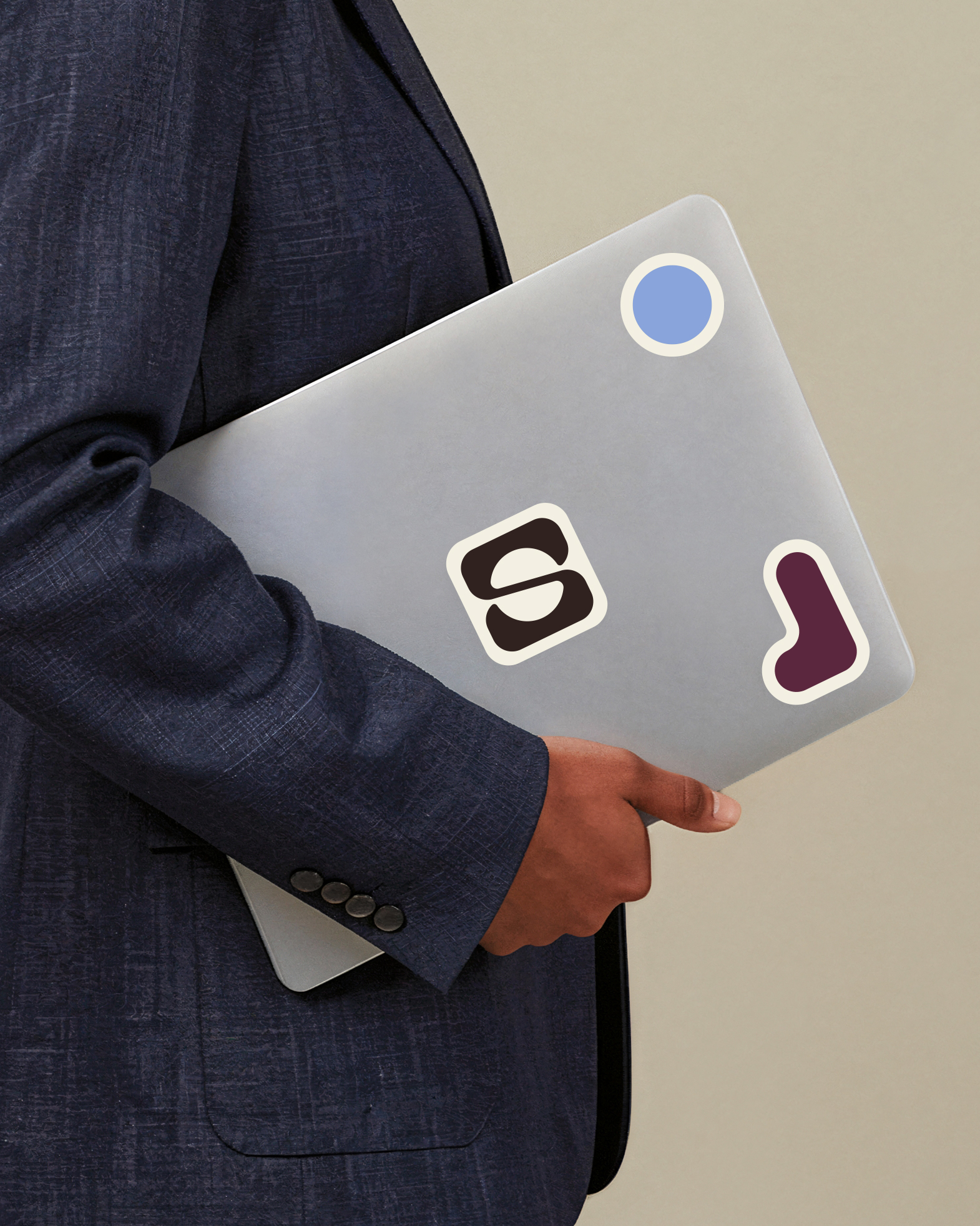
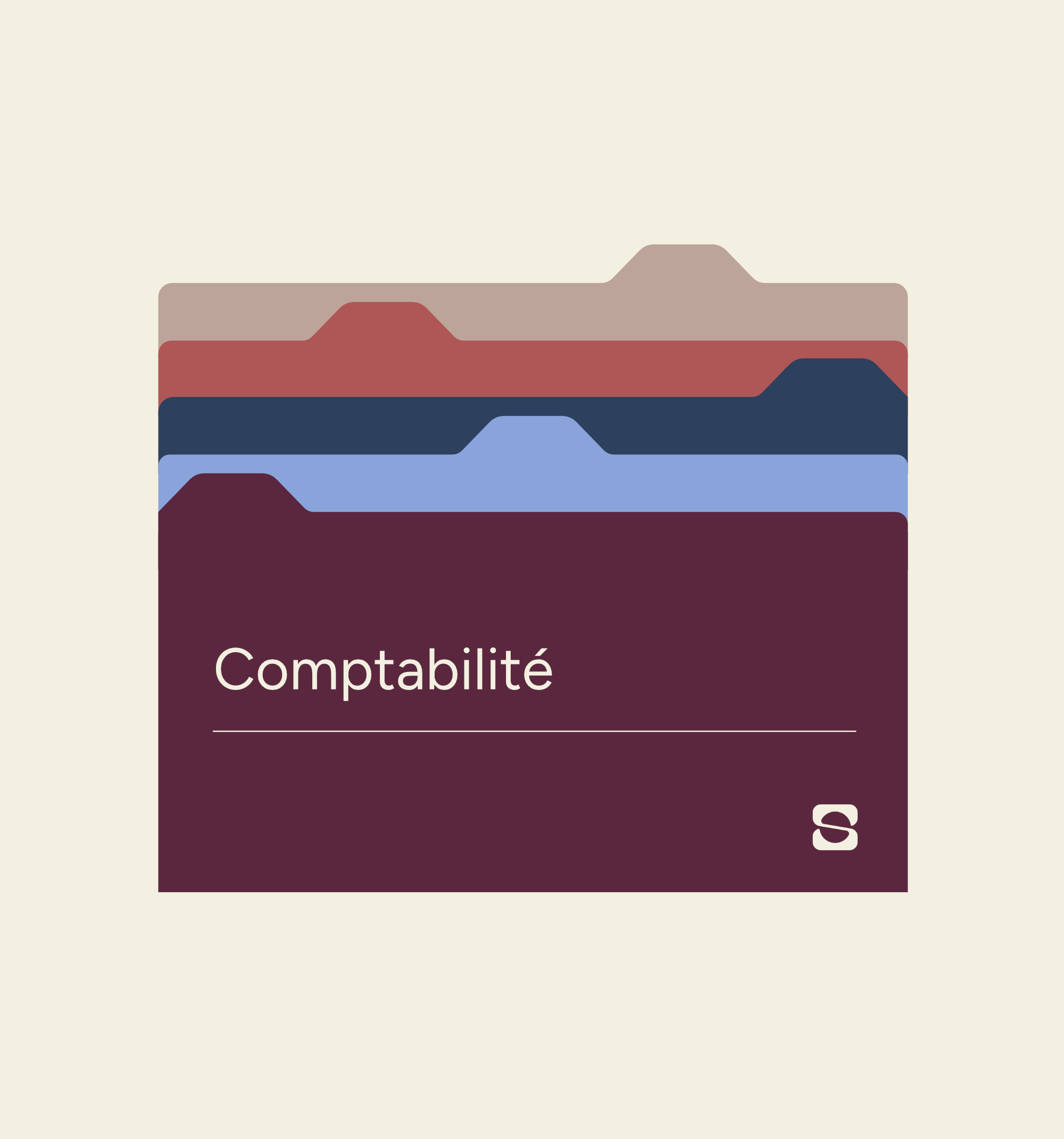
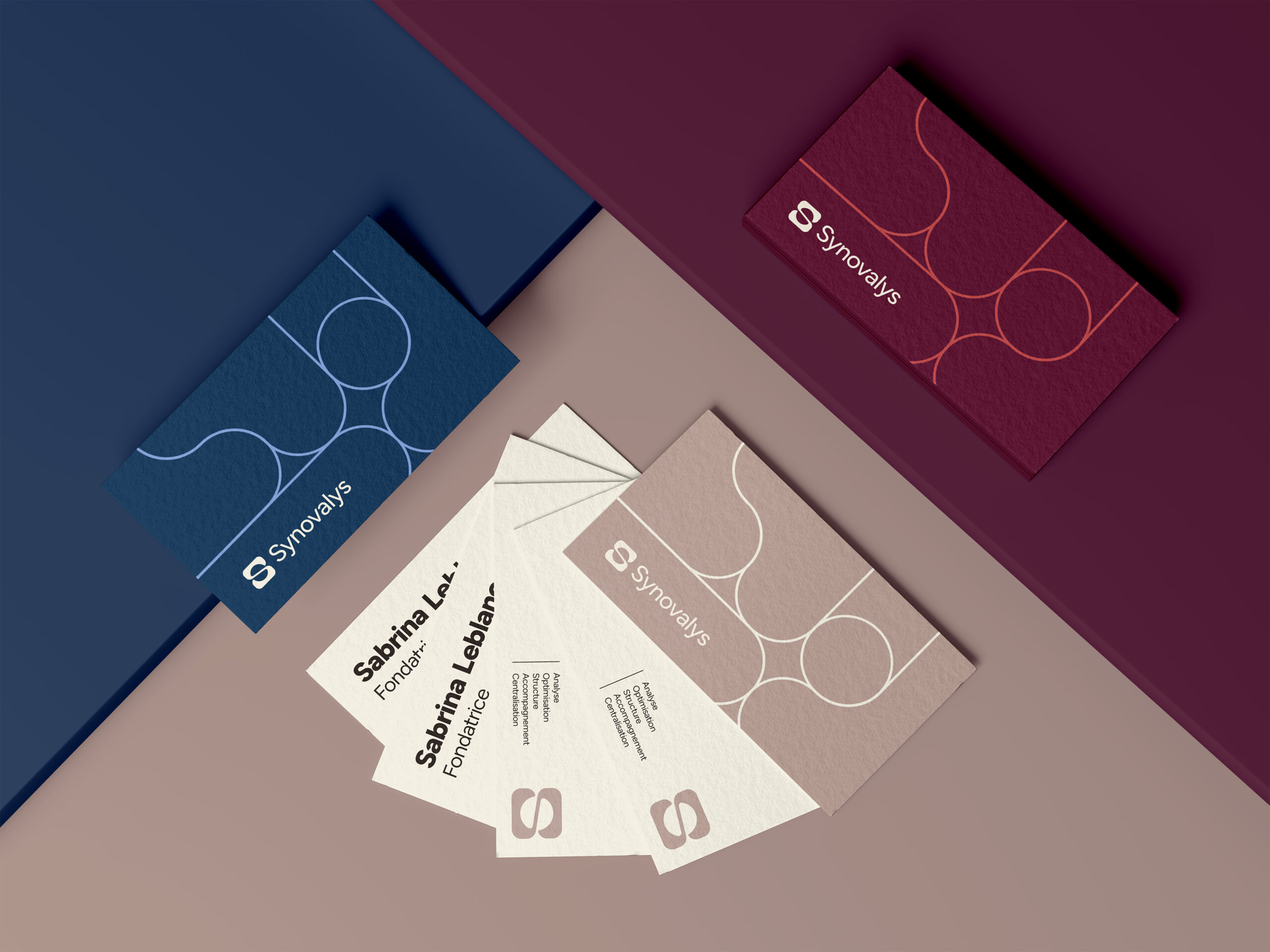
The Logo
Composed of soft curves, the logo conveys a fluid and human-centered approach while maintaining a strong and controlled foundation. It visually expresses the balance between guidance and structure, proximity and expertise.
A circle has been incorporated as negative space within a square to represent the centralized nature of the company’s offering. It acts as an anchor point, a core around which all services revolve. This circle is embraced by a fluid geometric shape inspired by the letter S for Synovalys, creating a symbol that feels both structured and organic.
On a more abstract level, the symbol can also be interpreted as an hourglass. This reading reinforces Synovalys’ promise: helping entrepreneurs reclaim their time, reduce mental load, and move forward with greater peace of mind.
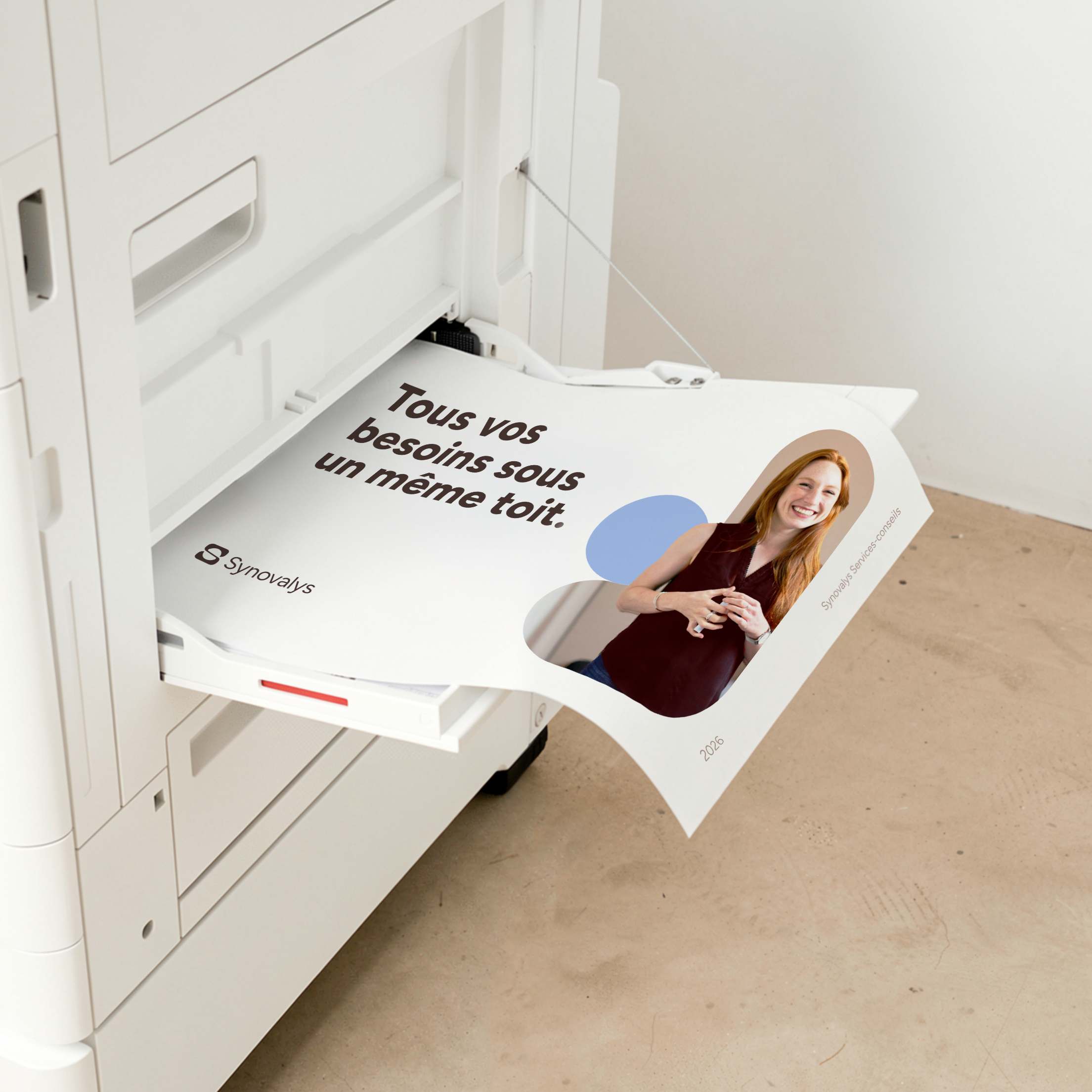
The Website
The website was designed as a natural extension of the brand identity, with a strong focus on information clarity and a seamless user experience.
Animations were implemented with intention and restraint, enhancing the experience without overwhelming it. Gentle transitions, progressive reveals, and subtle micro-interactions bring the interface to life while maintaining a sense of control and simplicity.
The site strikes a balance between dynamism and stability. Its structure remains clear and accessible, while movement adds a lively and engaging dimension. This approach faithfully reflects the essence of Synovalys: a company that brings structure to complexity while delivering support that feels both fluid and human.
The Client's Experience
I instantly connected with Solstice! They created my visual identity, and I loved their approach so much that I gave them a second mandate for my website. They are truly attentive, take the time to fully understand how you see things and what you want your business to convey. They explain their choices, answer questions, and you feel supported from start to finish. I would recommend them a thousand times over!
Sabrina Leblanc, Founder
Our other projects


For the love of collaboration