EvoluRythme
Project
Branding
Website
Our mission was to develop an identity that allows Nadia to connect deeply with her clients and inspire them toward change.
Nadia approached Solstice for the creation of ÉvoluRythme’s visual identity and website. She offers coaching in change facilitation to help her clients grow in their careers.
Direction
For the visual direction, we focused on two key values for Nadia: interconnectedness and rhythm. The goal was to visually convey the concept of guiding connections, collaboration, gathering, and progression according to the pace of Nadia’s clients. Since her clientele is primarily in the arts, we wanted to add a sense of creativity in motion.
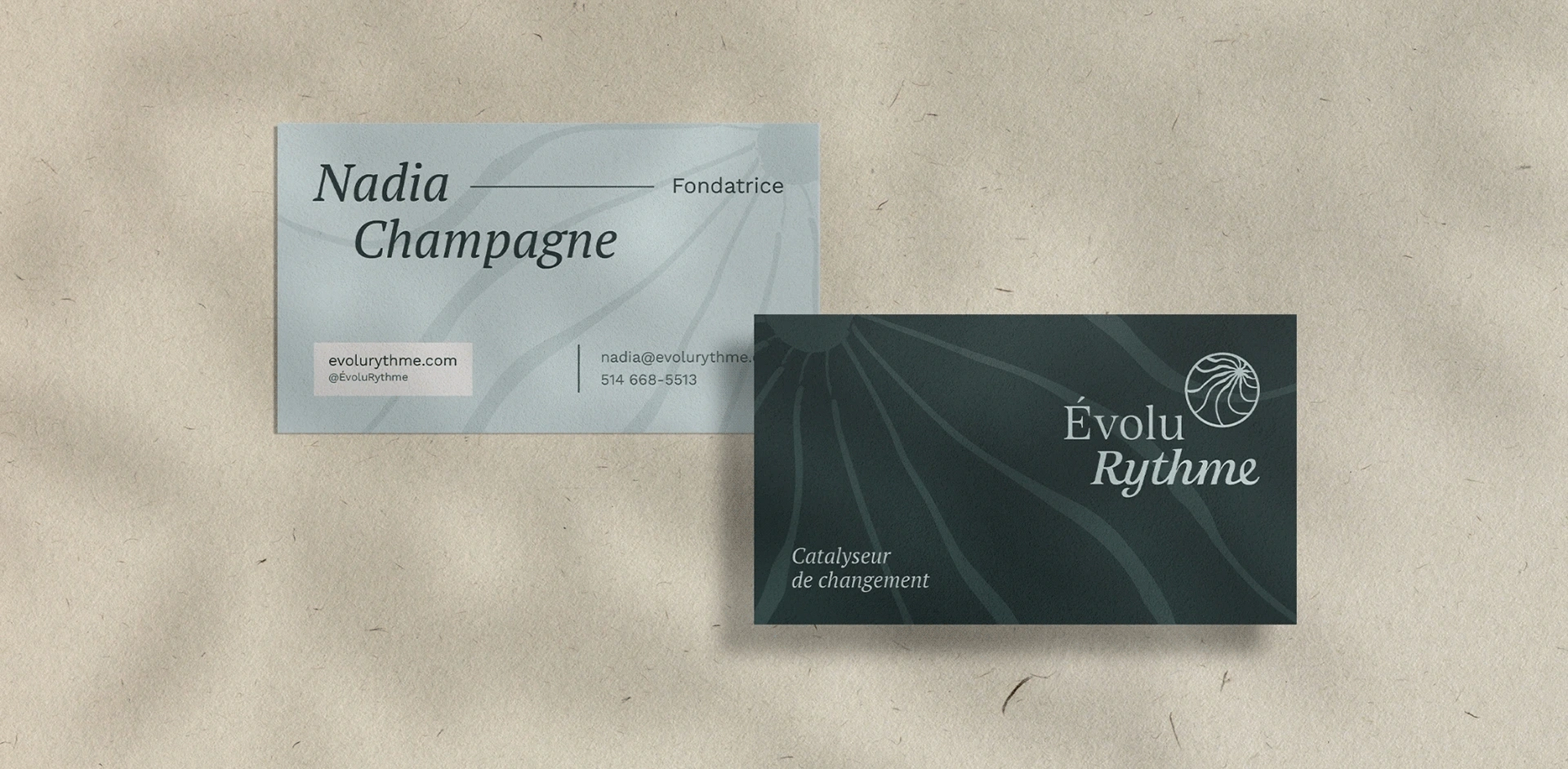
The Logo
The symbol represents the progression of the journey toward the heart or goal, depicted by the culminating point. Interconnectedness is illustrated by the convergence of different paths, each unique and vibrating at its own rhythm. The enclosing circle serves as structure, guide, and space for growth. The hand-drawn lines add a human and artistic touch to the overall design.
The typography reflects rhythm through two offset lines: one in upright letters and the other in italics. The second line features connected letters, symbolizing connection and movement. The serif type adds a soft, human quality to the overall feel of the logo.
Visuel world
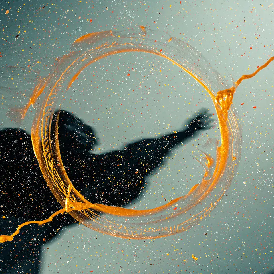
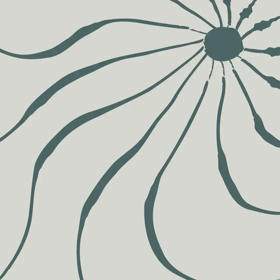
The colour palette is inspired by natural elements. Earth, air, and water are emphasized to create a connection with ÉvoluRythme’s transformative aspect. Fire is introduced through photographs featuring warm, vibrant, and dynamic colours. A texture derived from the lines in the logo symbol is used to add depth to various visuals.
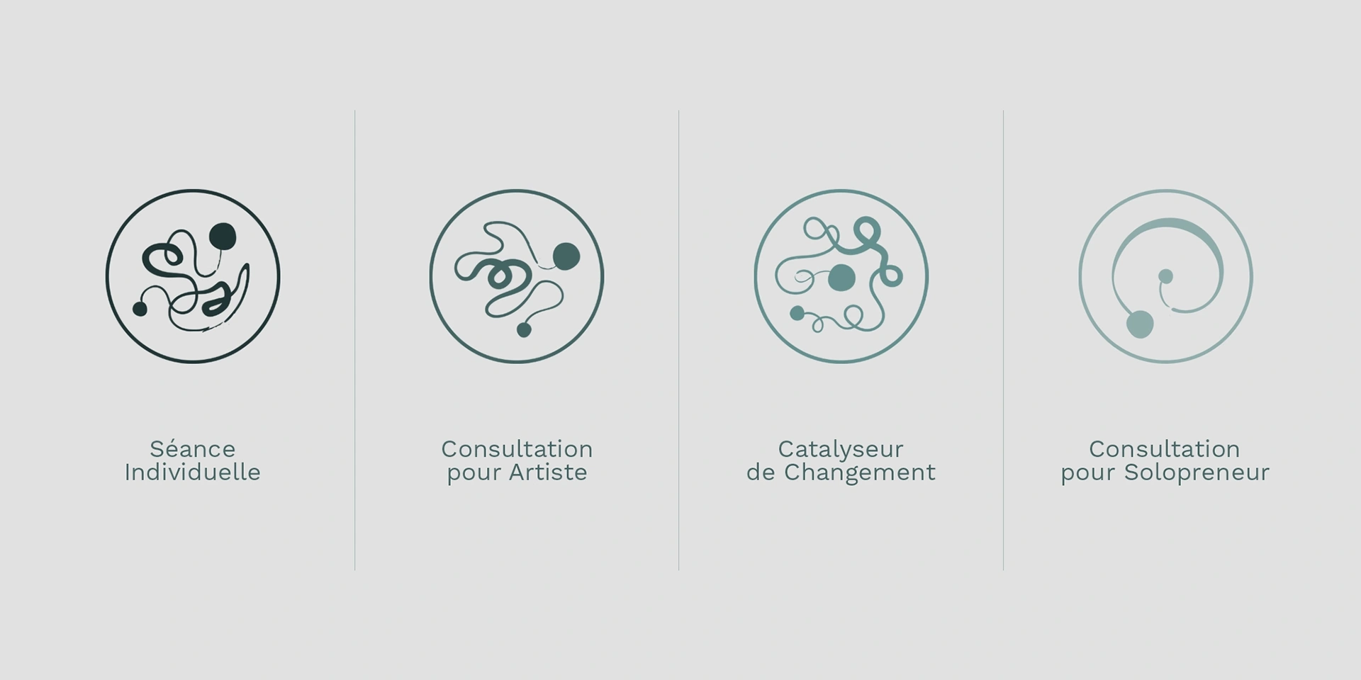
Iconography
The icons representing ÉvoluRythme’s core services were designed in line with the visual identity. Progression is depicted by an initial state (small circle) and the resulting state after ÉvoluRythme’s guidance (large circle). The lines crossing the circles echo the path to be traveled and the obstacles or blockages to be resolved. In the group coaching icon, the multiple knots also represent different individuals.
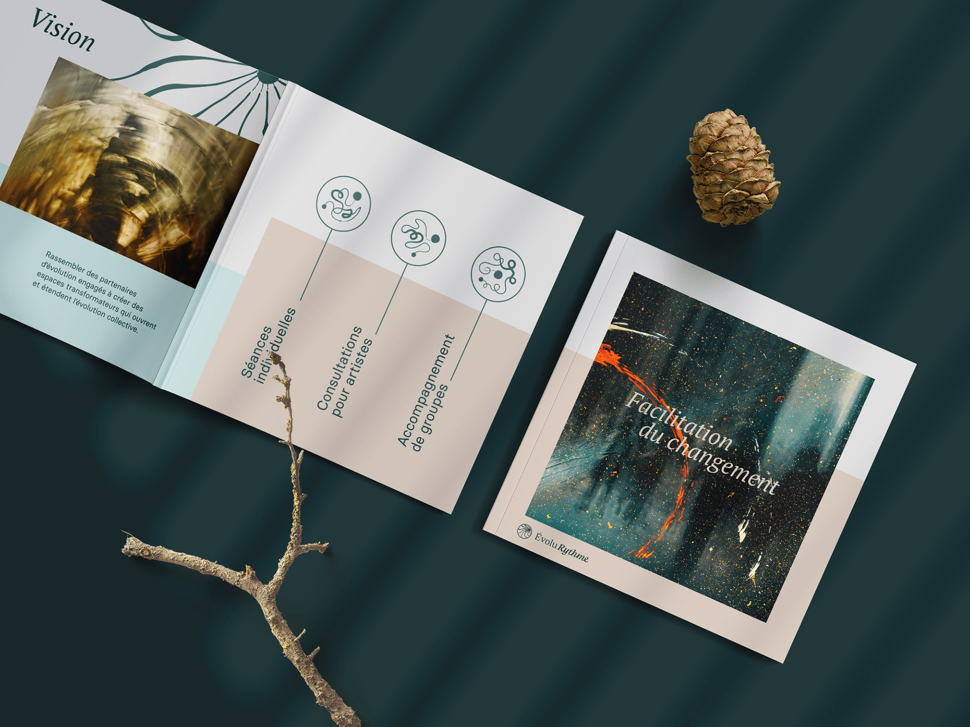
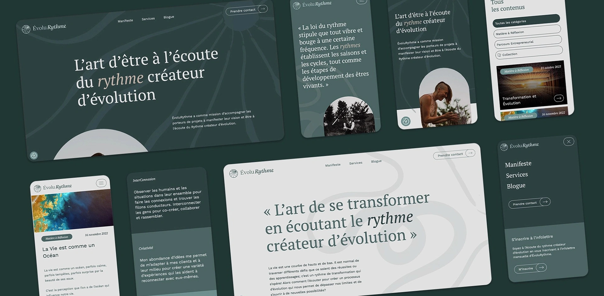
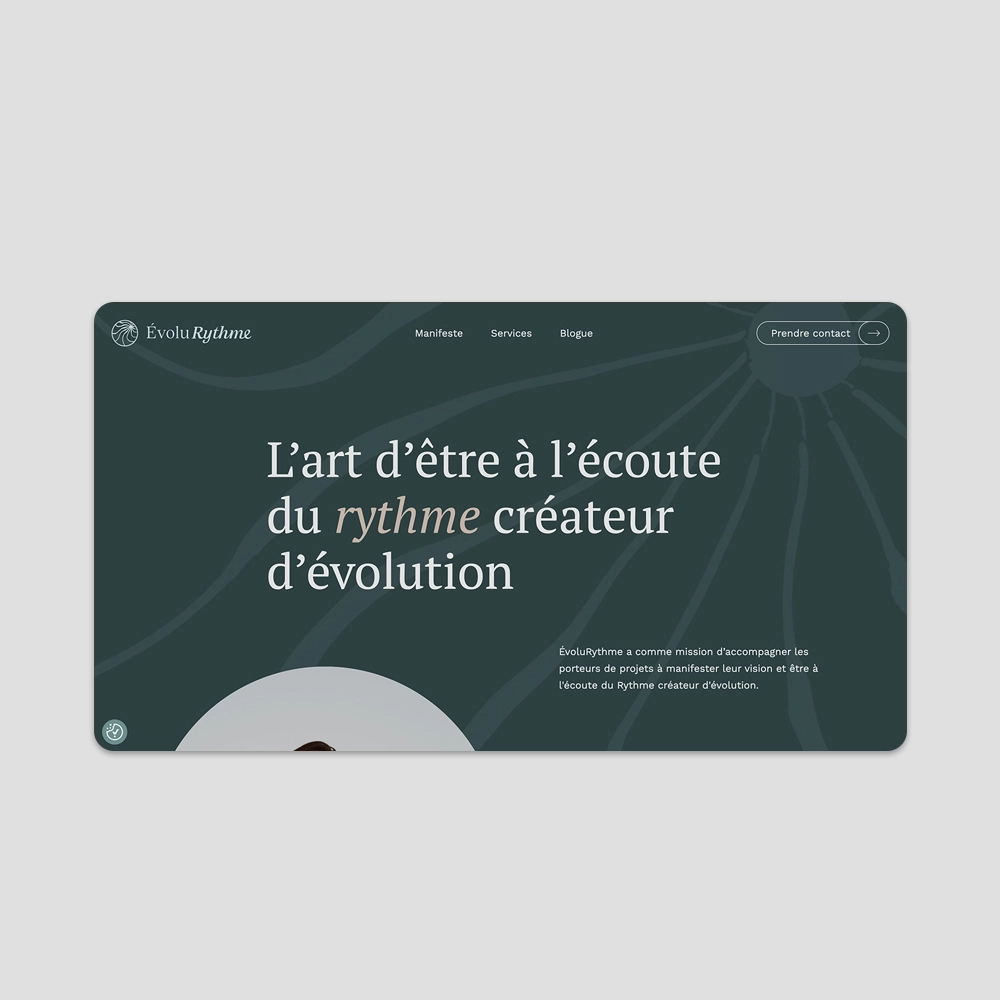
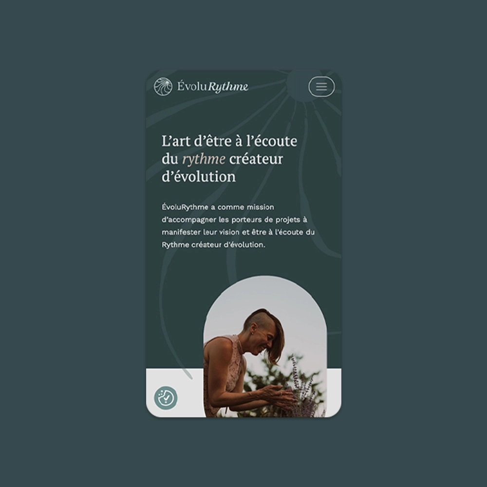
The Website
All elements of the identity come to life on the website. We aimed to create a smooth and dynamic experience, reflecting the company’s essence by integrating the different graphic elements of the identity. The appearance animations help energize the visuals. Calls to action echo the logo: the typography starts upright and transforms into italics when hovered over. The blog is designed as a journal format for a more intimate feel, highlighting Nadia’s voice and reflections.
The Client's Experience
Thank you to Johanny and Alexandre for this collaboration, which allowed me to create a work rich in meaning.
Your sensitivity, attentiveness, and thoughtful questions have been a springboard for growth. My vision was greatly enhanced by your expertise and passion in creating this virtual work that touches my heart. Thank you for bringing my company’s identity and website to life—I am deeply grateful.
Nadia Champagne, Founder
Our other projects

For the love of collaboration