Jeux FC Laval 2025
Project
Branding
Illustration
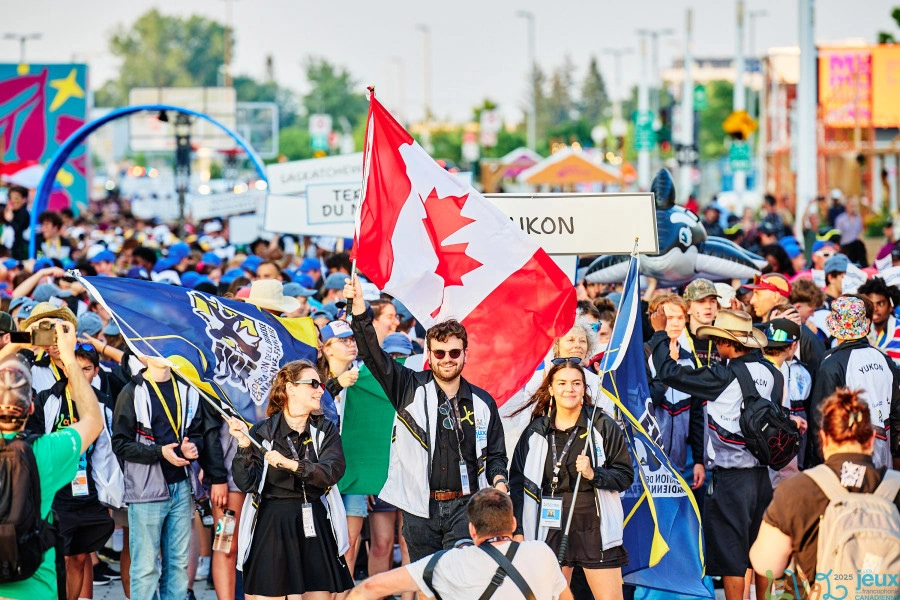
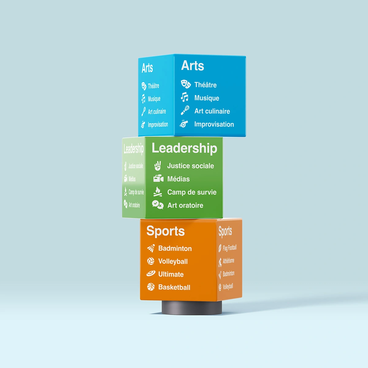
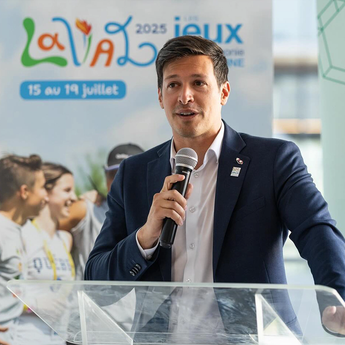
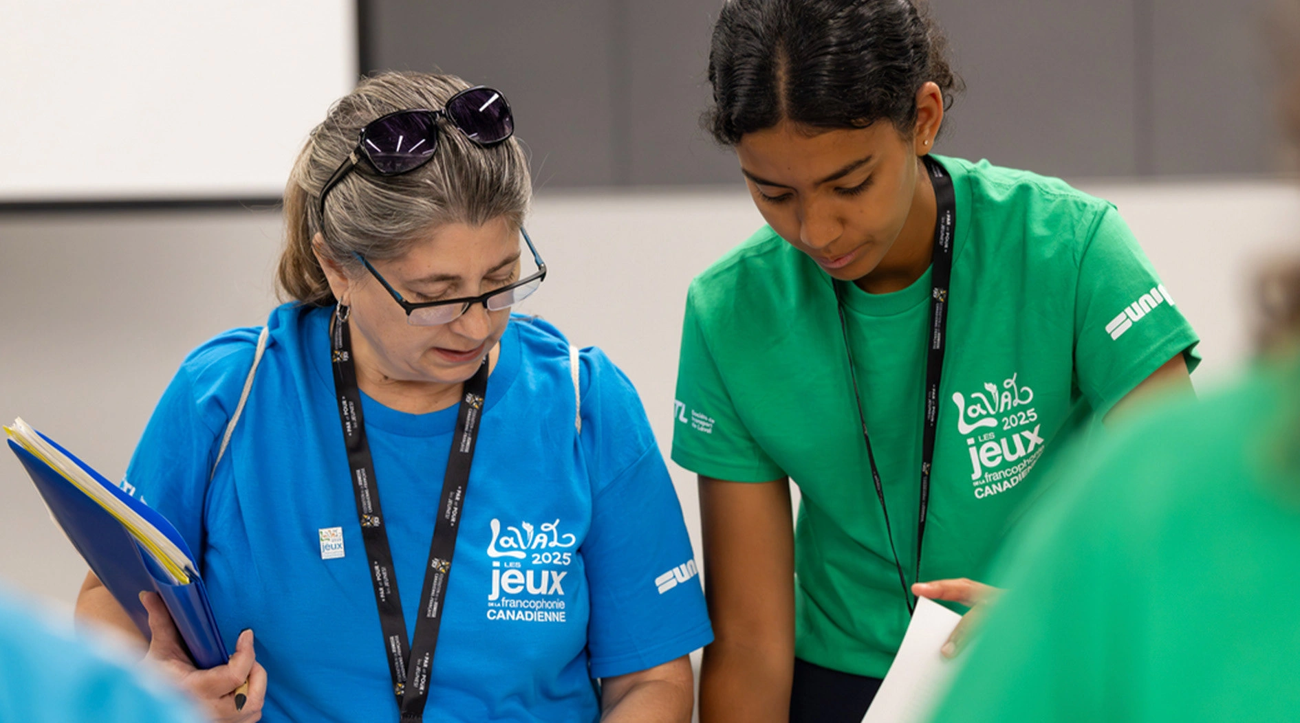
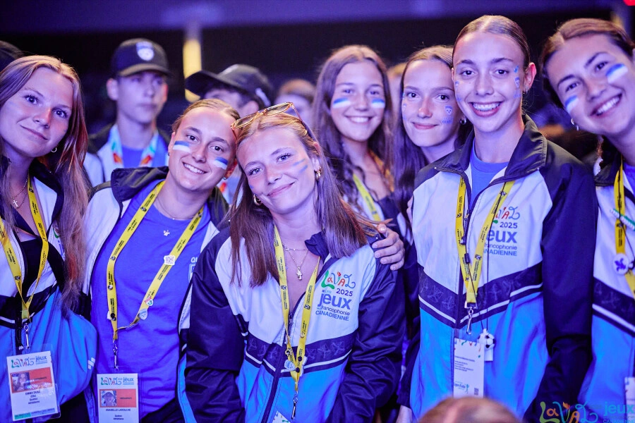
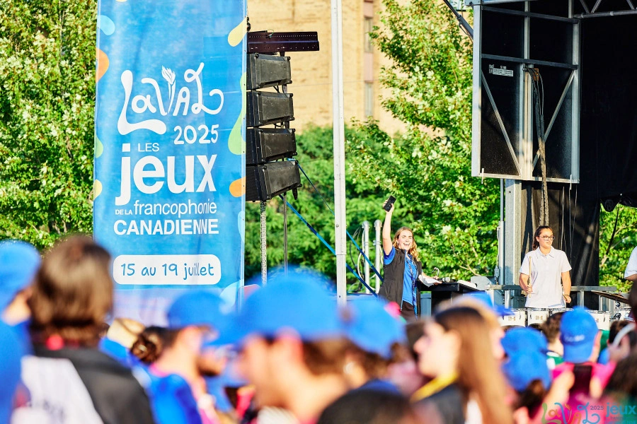
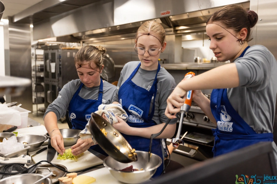
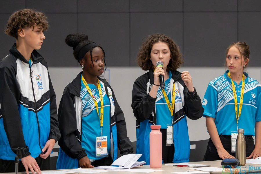
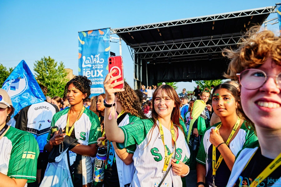
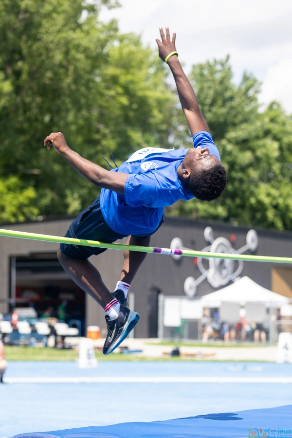
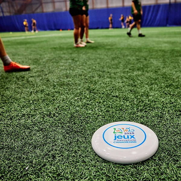
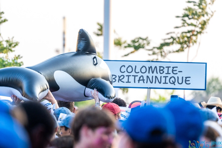
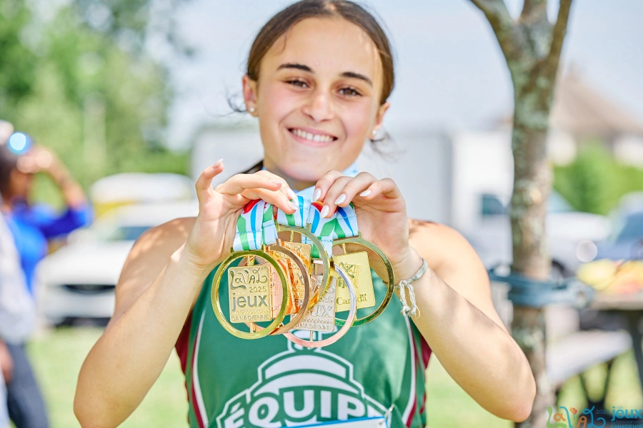
The 8th edition of the Canadian Francophone Games, held in Laval in July 2025, brought together hundreds of French-speaking youth from across the country. Through the arts, leadership, and sports components, the event celebrated diversity, strengthened the sense of belonging, and fostered community spirit.
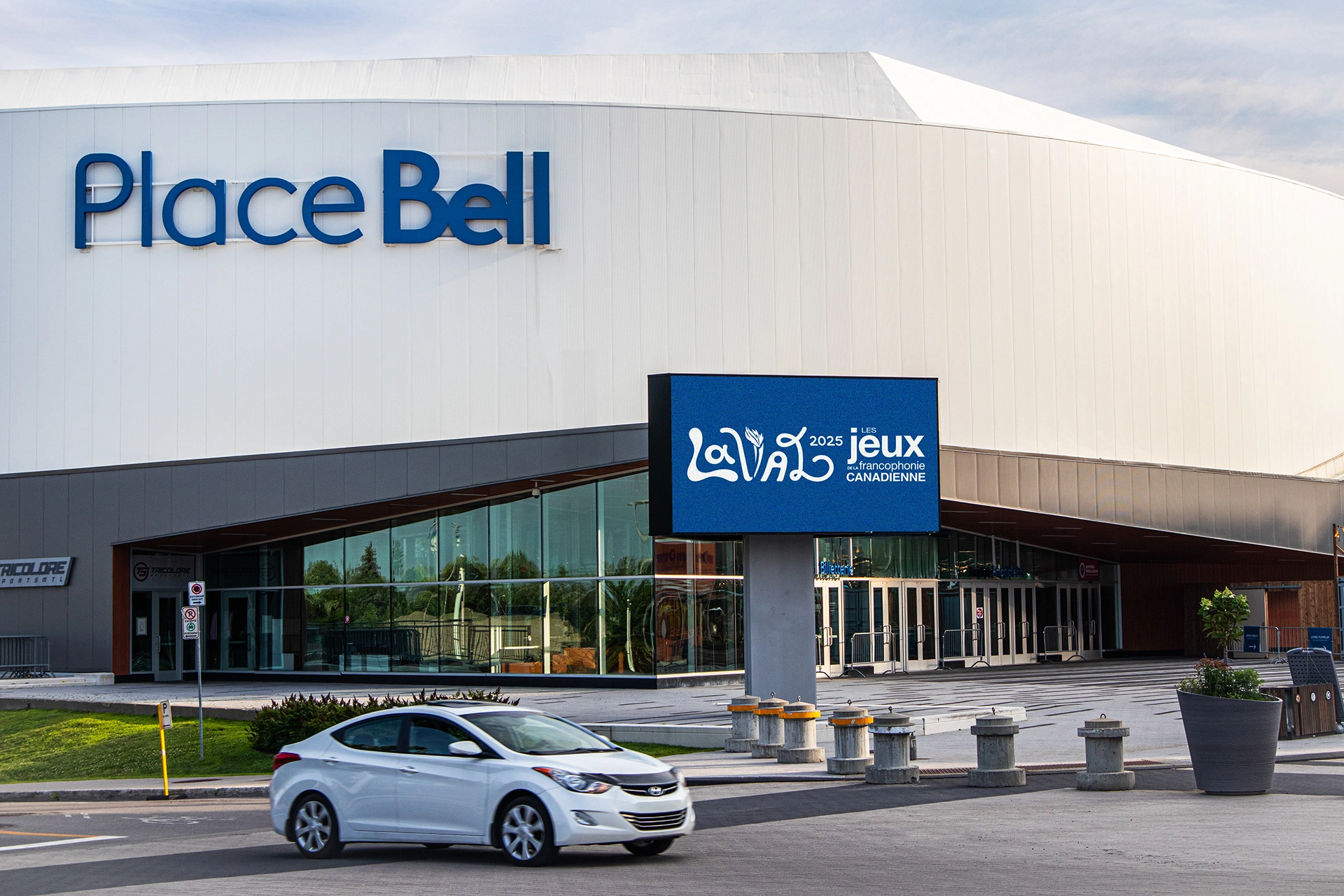
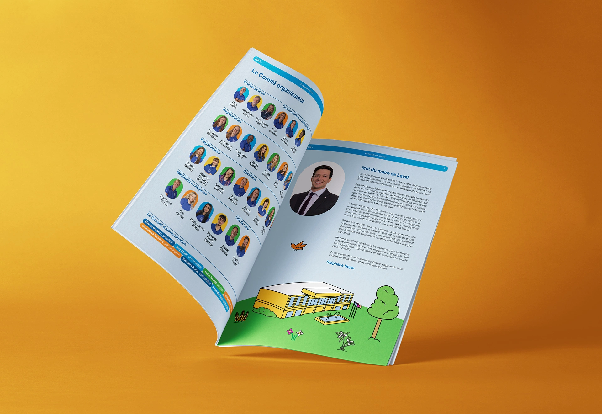
Our mission was to design the official visual identity for this edition, reflecting both the JeuxFC and the city of Laval: the visual identity, the main poster, as well as a variety of printed and digital graphic elements.
Challenges
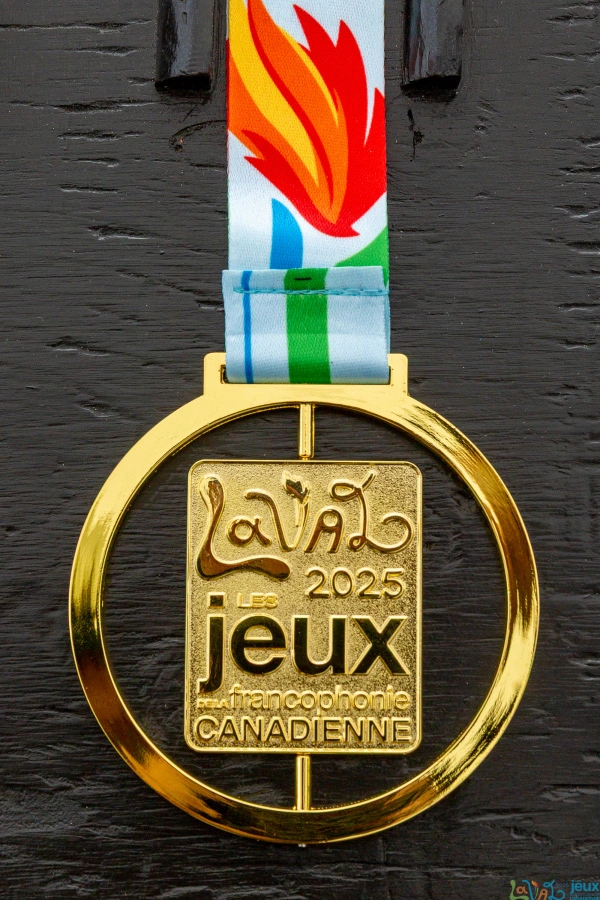
This mandate took place in a particular context: it was necessary to imagine a distinctive visual identity for the Laval edition, while respecting the national graphic guidelines already established for the JeuxFC: color palette, official typefaces, and integration of the JeuxFC logo, featuring the flame.
The challenge was therefore twofold: to create a visual signature unique to this edition without betraying the essence of the JeuxFC, while working within fixed parameters, and at the same time infusing emotion, energy, and a unique personality that reflects the host city, Laval.
A beautiful exercise in balancing structure and creativity.
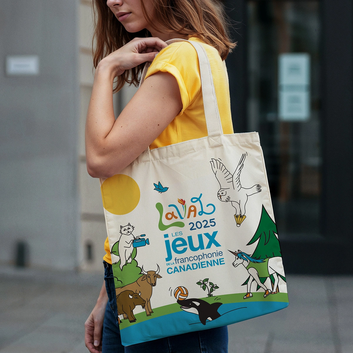
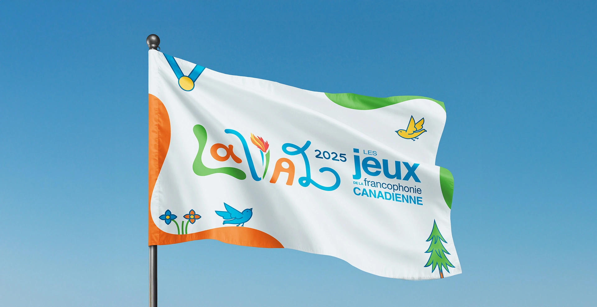
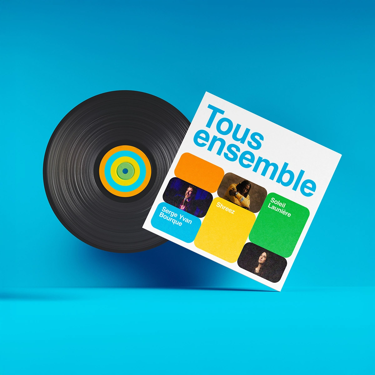
Visual Identity
The logo for the 2025 edition is built on illustrated letters with varied, dynamic, and colourful shapes. Each letter expresses an aspect of the diversity of the young participants and the vitality of the Laval community.
Together, they evoked movement, gathering, and creativity, core values of the Games. Visually, the whole fit within the continuity of the main brand, while asserting a strong and memorable signature for this edition.
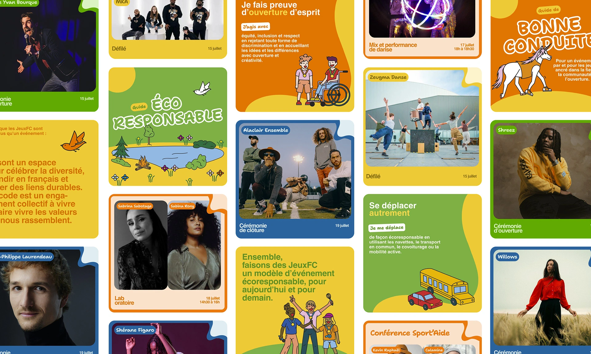
Illustration
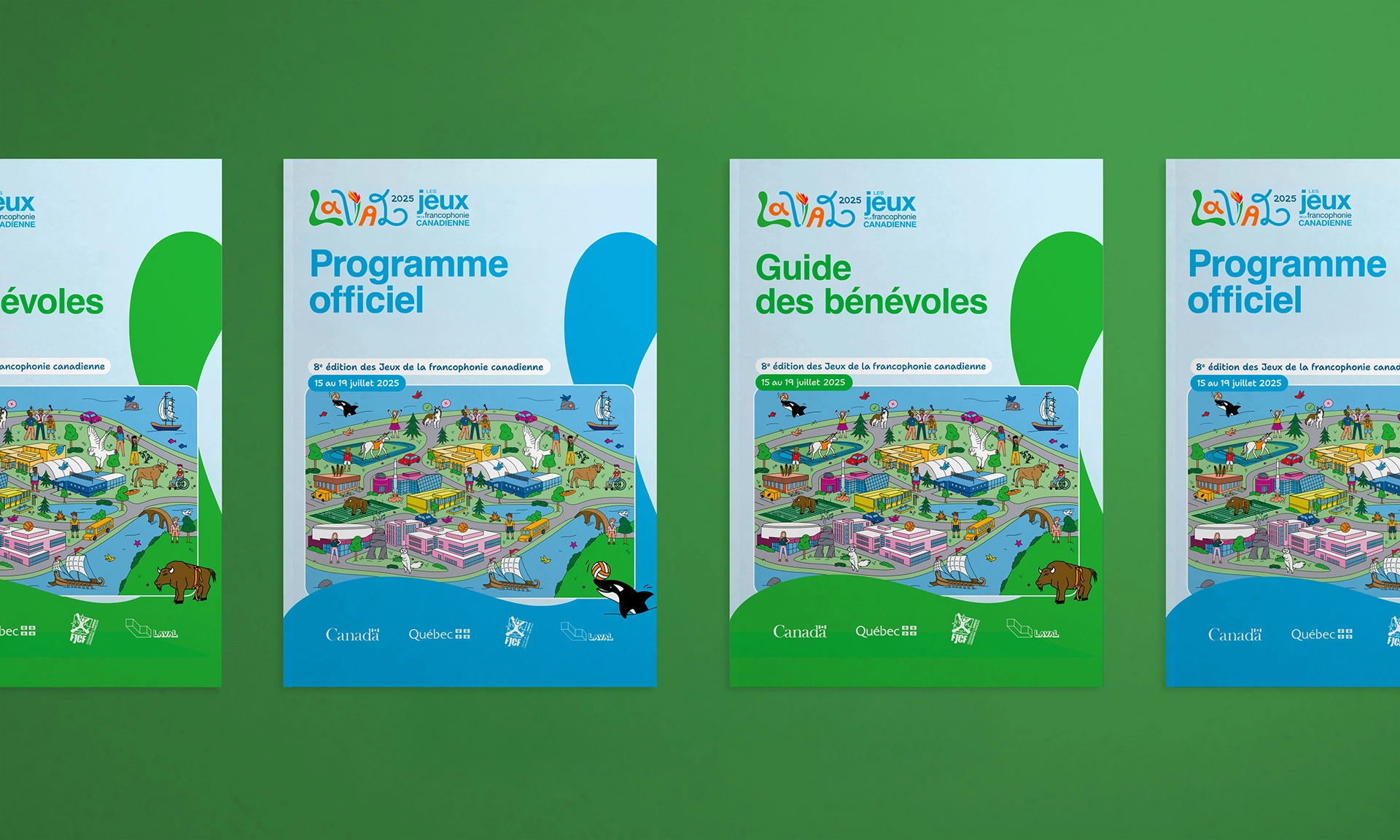
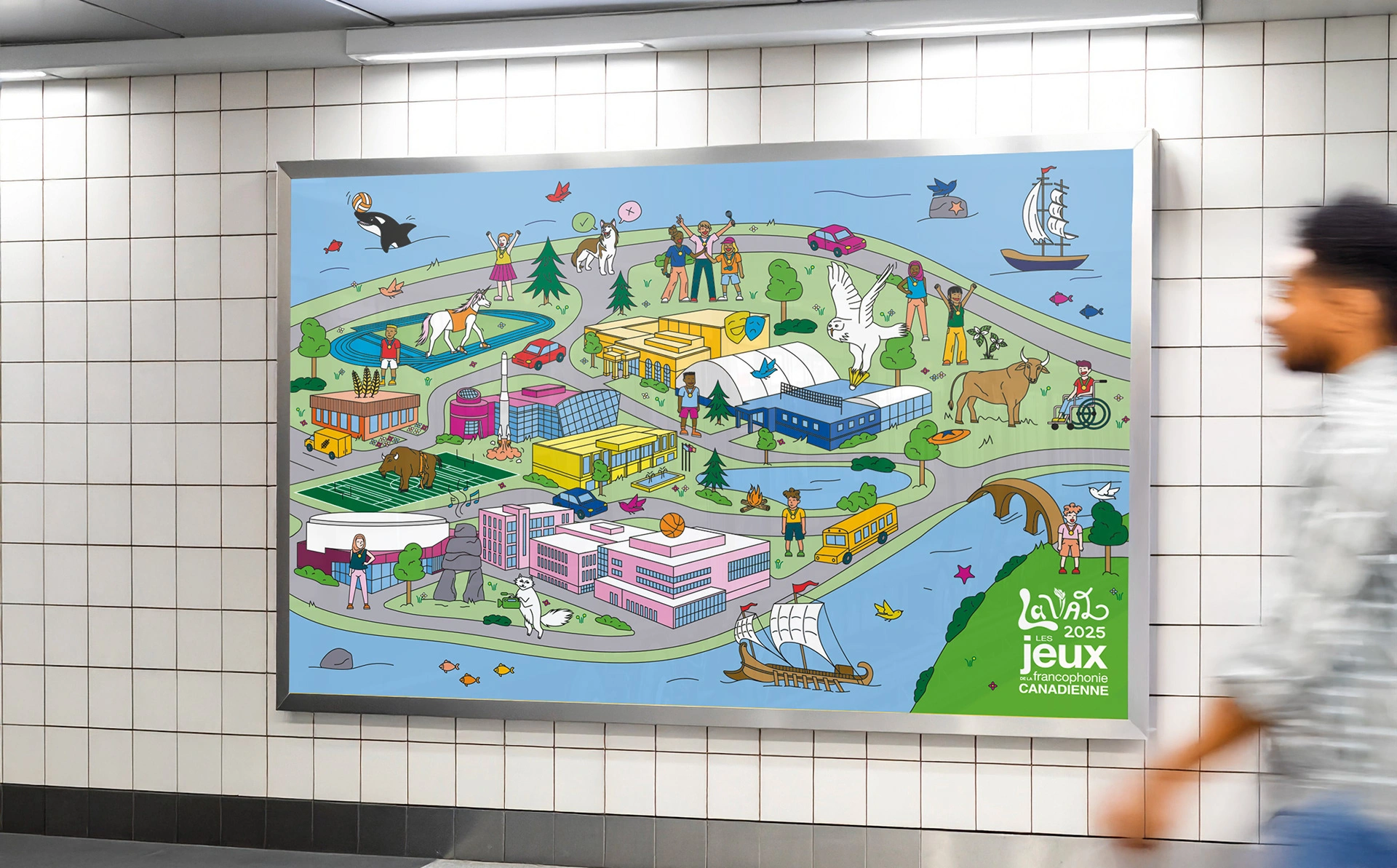
One of the centerpiece deliverables of the mandate was the creation of the official poster for the JeuxFC 2025: an illustration conceived as both a commemorative and playful object, inspired by the Where’s Waldo? concept.
The idea was to depict the island of Laval as a living place, where the JeuxFC literally take shape.
Illustration
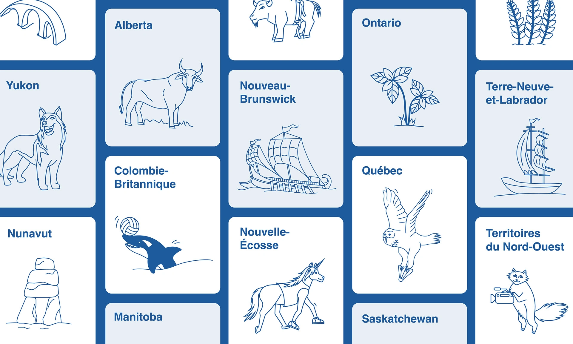
The illustrative style is warm, accessible, and joyful, bringing the JeuxFC story to life. It features the symbols of each Canadian province and territory integrated into the landscape, the buildings and venues that hosted the competitions and ceremonies, icons representing specific disciplines, as well as characters and other details that reflect the values of the JeuxFC.
Illustration
The illustration harmoniously blends the official color palette of the JeuxFC with that of the City of Laval, anchoring the event visually in its territory while maintaining coherence with the overall brand image.
It was designed so that each look would reveal a new detail, a nod, a symbol… A way to extend the JeuxFC experience through imagery, and to offer a lasting memory to those who took part.
Conclusion
The visual identity created strong cohesion across all communications while giving the Laval edition a distinct personality. It helped visually convey the event’s values and strengthened the sense of belonging among participants, volunteers, and partners.
The Client's Experience
The support was simply outstanding: strict adherence to deadlines, remarkable quality of deliverables, and a consistently enjoyable collaboration. Solstice demonstrated attentive listening, professionalism, and genuine care throughout the project.
I wholeheartedly recommend Solstice to any organization looking to carry out a project with thoroughness, creativity… and above all, with pleasure.
Émilie Duquette, Director of Communications and Partnerships
Our other projects

For the love of collaboration