Panora
Project
Branding
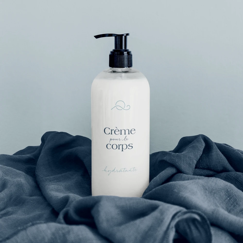
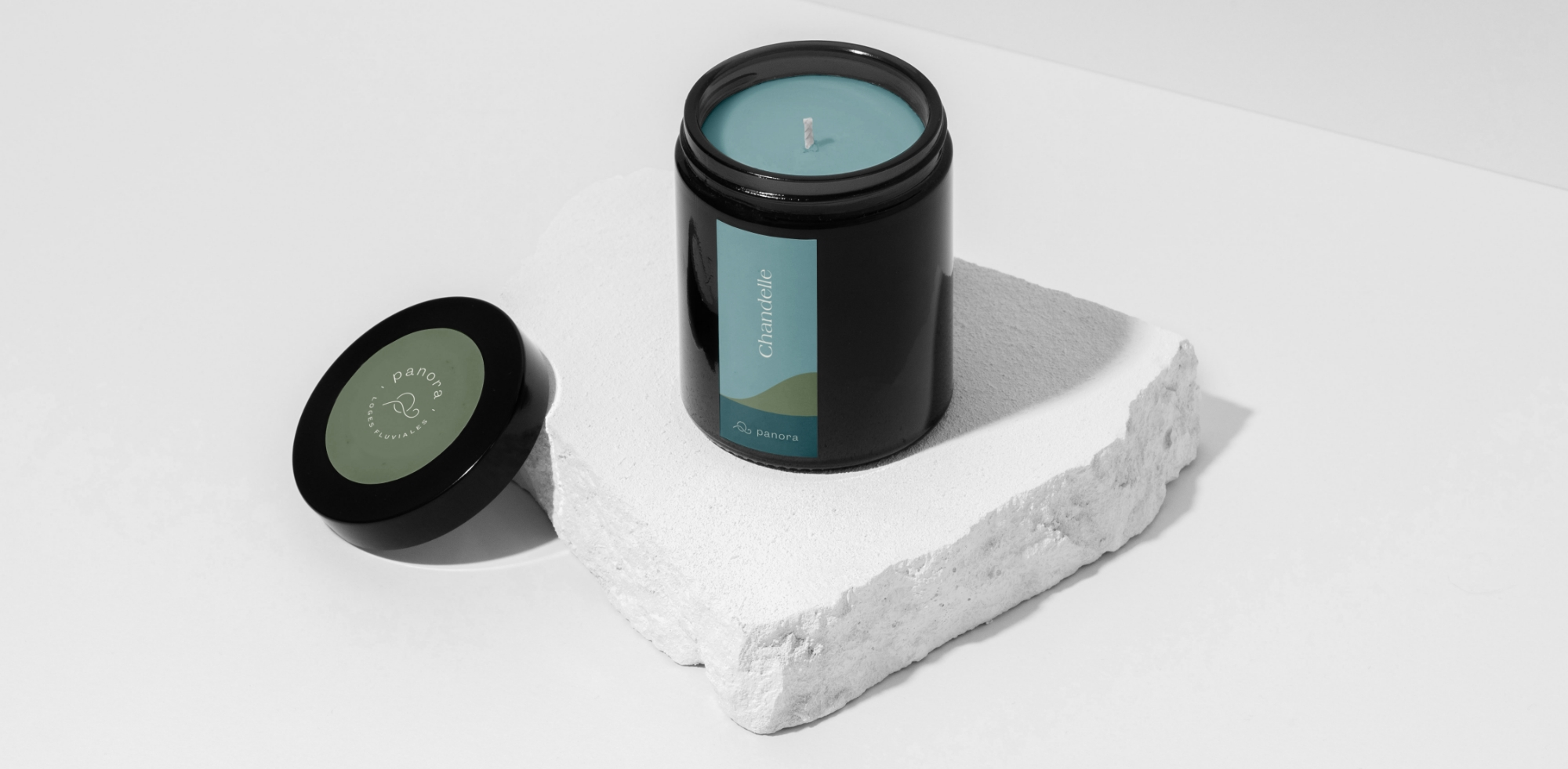
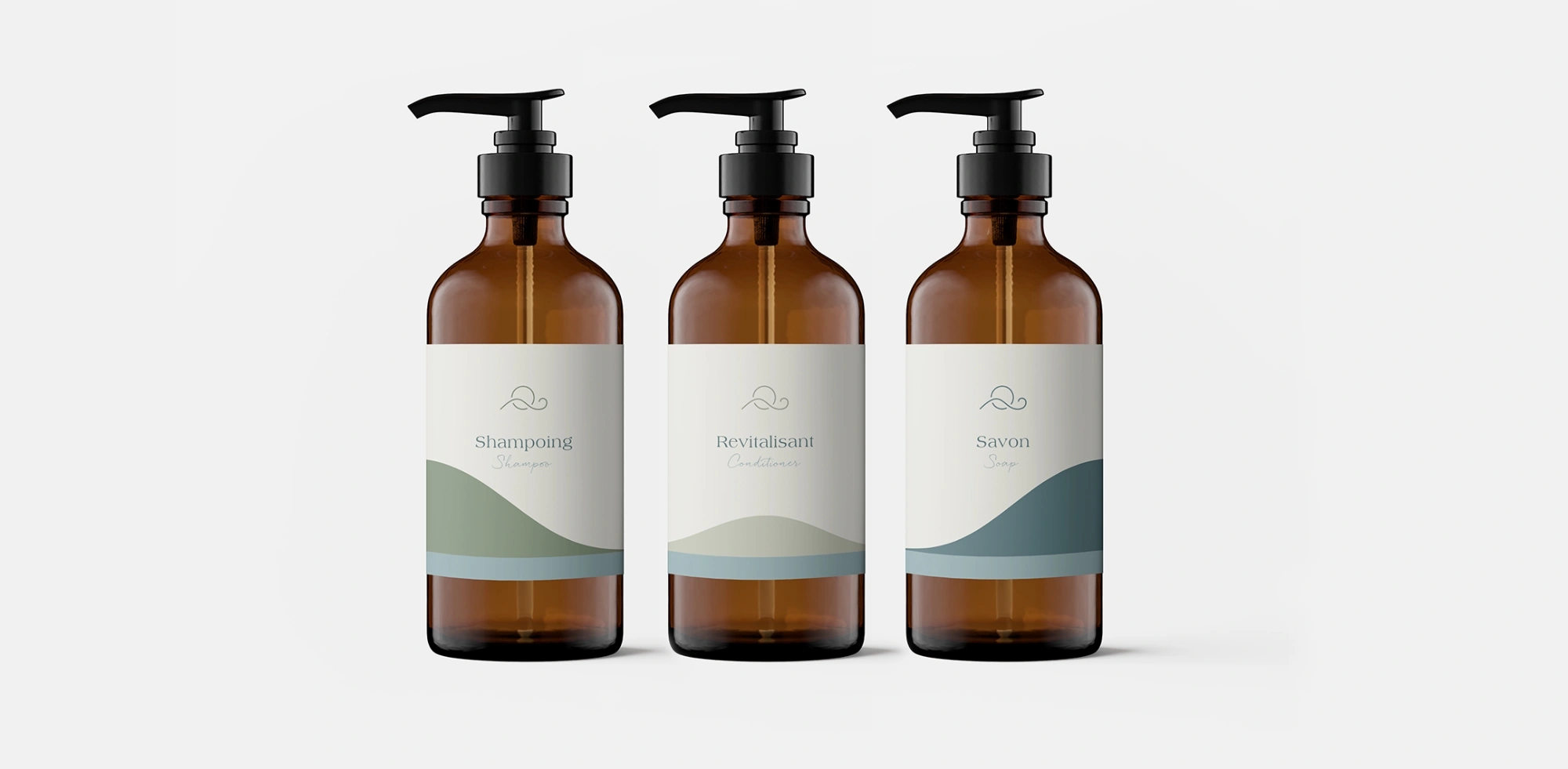
Packaging
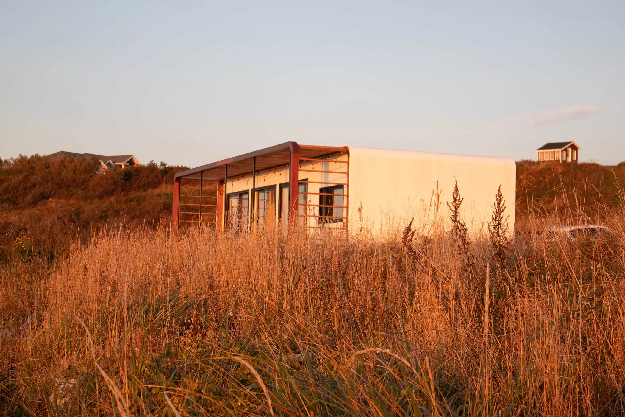
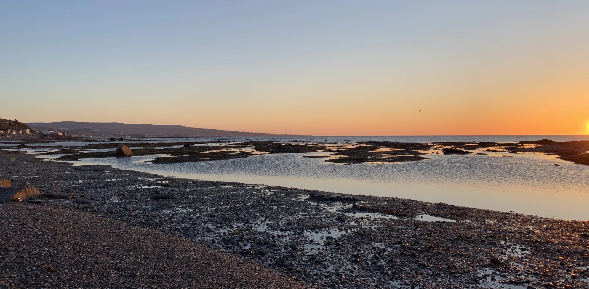
Ghislain, Marc-André, Cédric, and Hubert wanted to showcase the Gaspésie region year-round through a high-end lodging offer, emphasizing comfort and the magic of the coastline.
Johanny contributed to the visual identity strategy and took charge of its creation and applications.
Direction
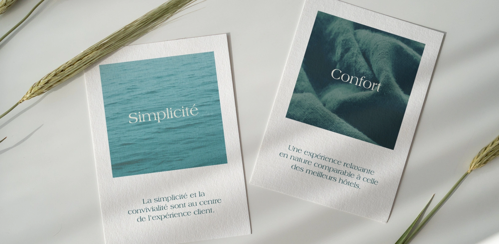
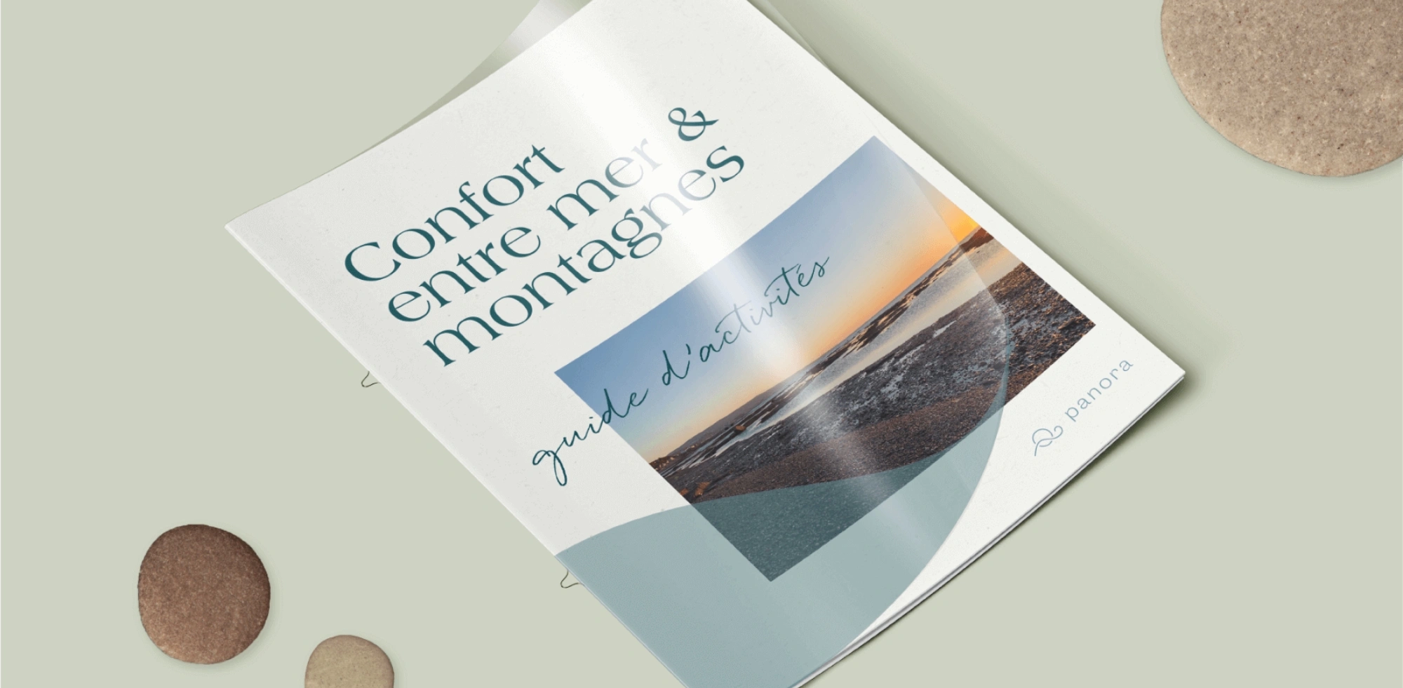
Guided by their values, simplicity, comfort, quality, and innovation, Johanny developed the visual direction. An analysis of competitor logos and inspiration research helped us find a style that stands out in the niche. One of the highlights of the Panora experience is the proximity of the river to the units. Guests can watch sunsets over the water directly from their rooms. We explored visual directions to convey this sense of wonder through the brand image.

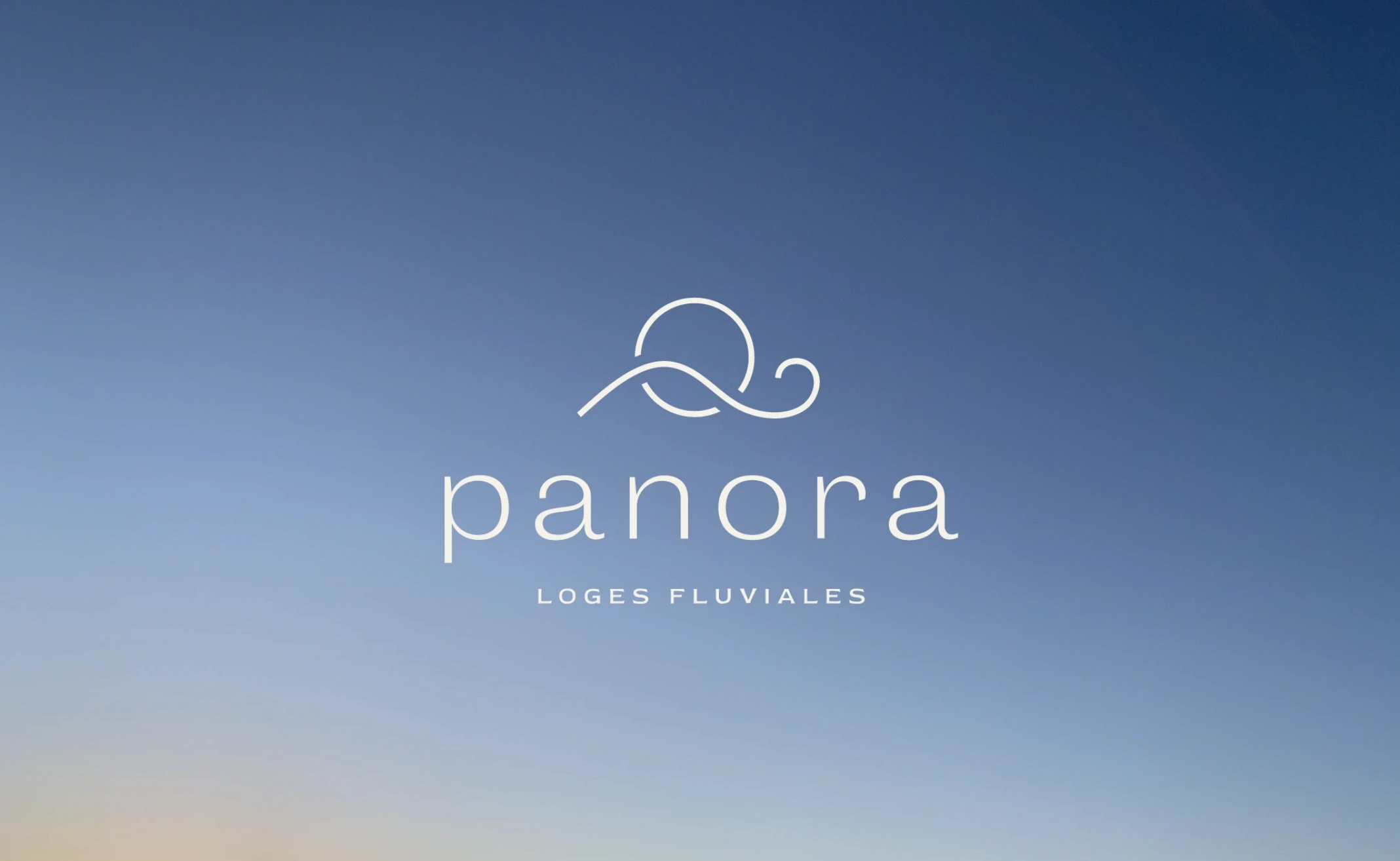
The Logo
The symbol reflects multiple elements of nature. The circle represents the sun, while the line can become a wave, a mountain, or a sand dune. The logo conveys elegance, nature, and tranquility.
The spaced typography evokes the horizon line and the grandeur of the river, while the small curve in the letter “a” echoes the wave in the symbol.
Together, these elements create perfect harmony and imbue the logo with a sense of well-being.
Visual World
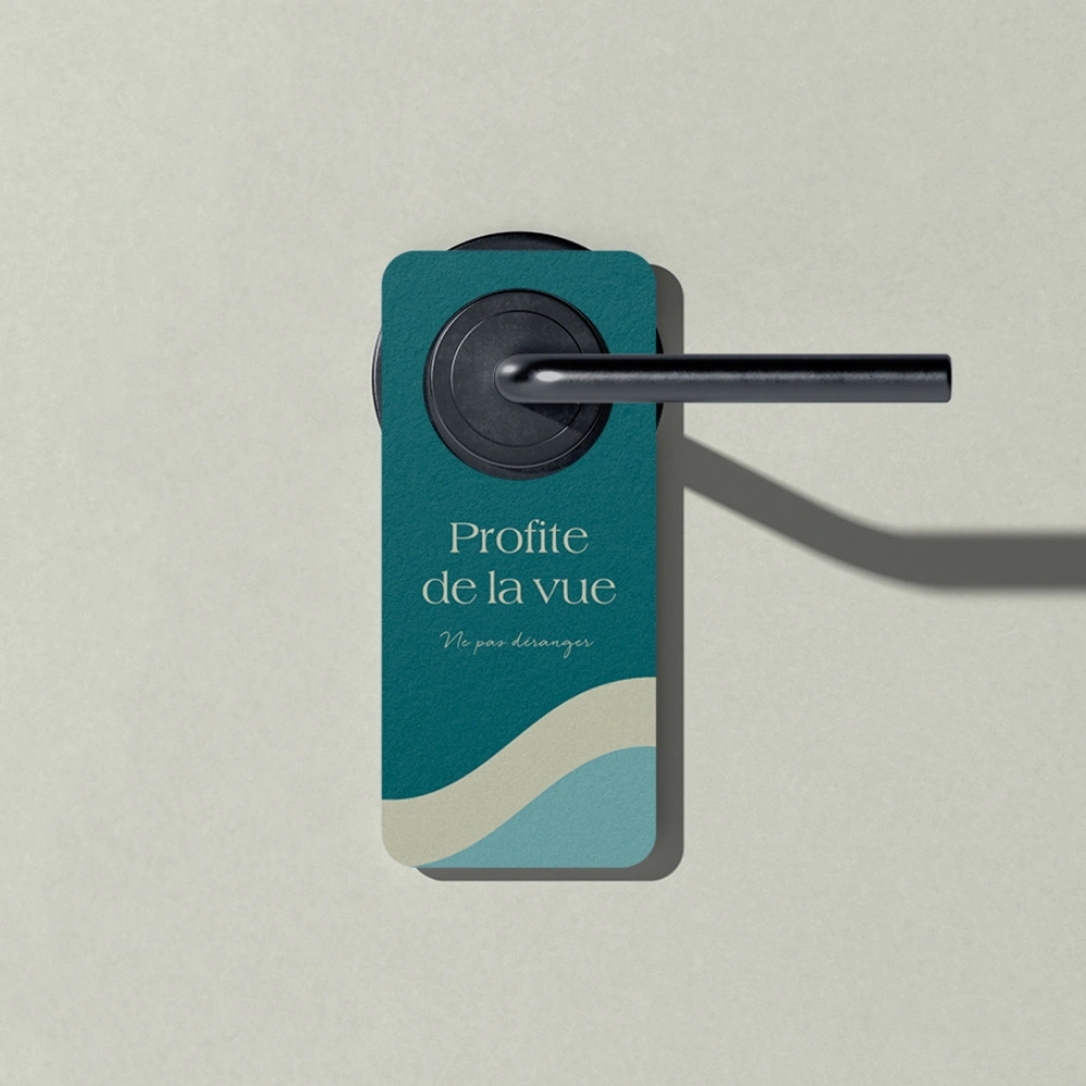
The colours, typography, and illustrations were chosen and designed to convey calm and well-being. The natural colour palette was warmed with secondary colours to reflect the dynamic side of Saint-Anne-des-Monts, representing the many outdoor activities as well as the local shops and restaurants. The illustrations are soothing with soft, curved lines, while the typography adds elegance and a human touch through cursive lettering.

The Client’s Experience
Great work and a wonderful collaboration with Johanny! She perfectly captured exactly what we were looking for in a brand image. We highly recommend Johanny for any graphic work!
Hubert Parent, Project Manager
Our other projects

For the love of collaboration